Objectives
- Get familiar with the platform layout
- Quality control filter data
- Sub-cluster within a cell type
- Differential expression analysis between subclustered cell types
Get familiar with the platform layout
- Log into the Latch console or create a profile if needed.
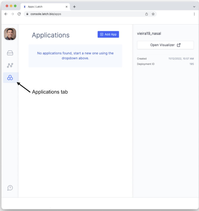
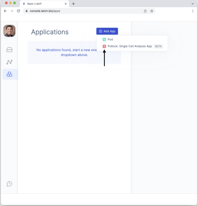
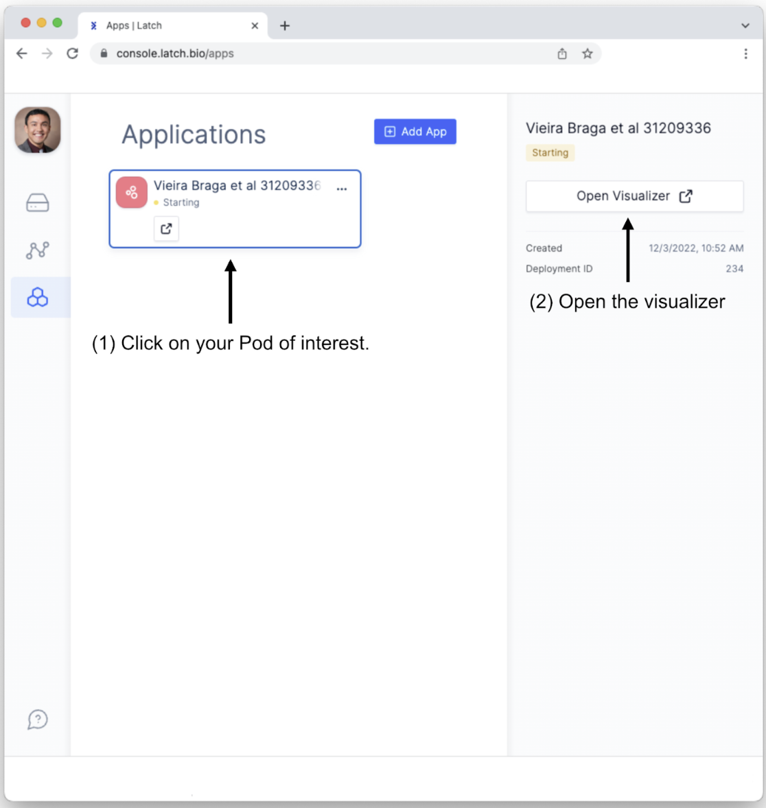
- Click on the Applications or “Apps” tab on the left sidebar menu.
- To create a Pollock pod, click on the “+ Add App” button and select “Pollock: Single Cell Analysis App.
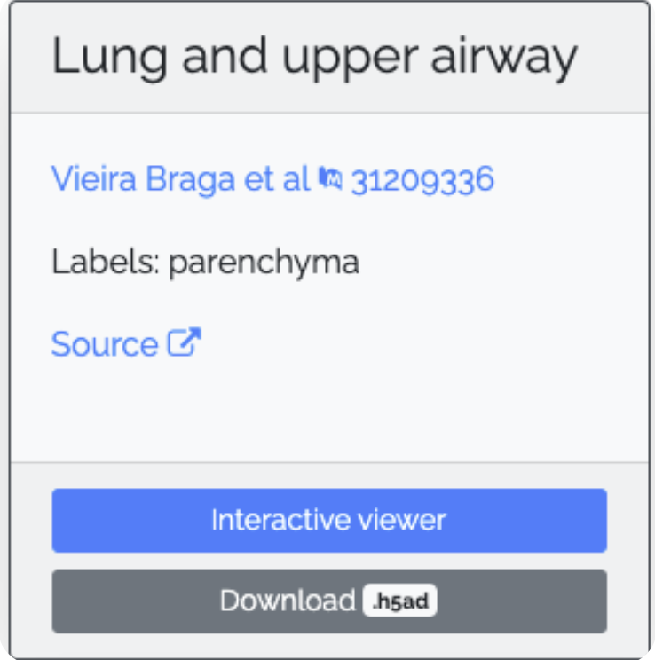
- To create a single-cell analysis application, first, give it a descriptive name and upload your data in H5AD file format. A cellular census of human lungs identifies novel cell states in health and in asthma by Vieira Braga et al. Nat Med. 2019 Jul;25(7):1153-1163. doi: 10.1038/s41591-019-0468-5, which is available from the COVID19 Cell Atlas. Specifically, we will be examining single-cell data obtained from the lung and upper airway. The H5AD file to download will look like this:
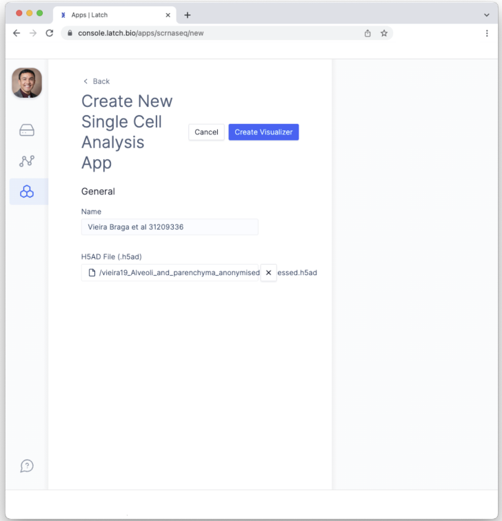
- Click the “Create Visualizer” button. This will create the Pod.
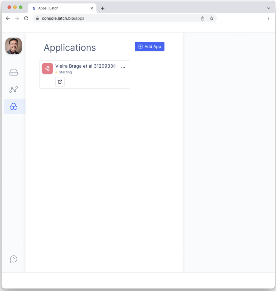
- Click on the Pod, which will open a sidebar on the right. Click on the “Open Visualizer” button to open the interactive Pod for exploring single-cell RNA sequencing analysis.
- This will open the landing page for exploring single-cell sequencing data. (This may take a moment to load fully.) Let’s familiarize ourselves with all of the options for data explorations.
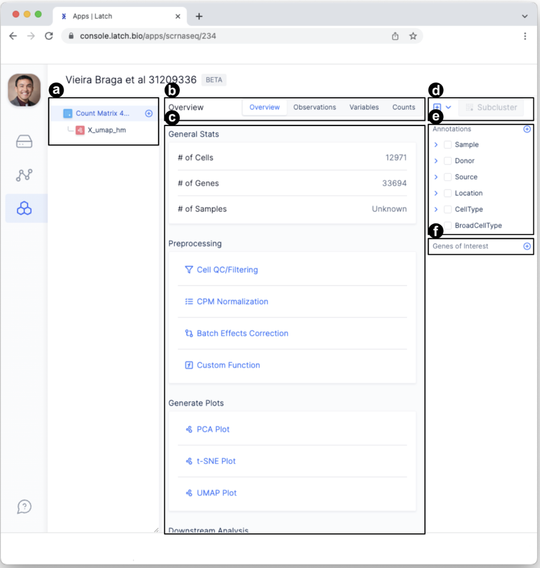
- The left sidebar displays a hierarchical view for data exploration and processing. After conducting new analyses (e.g., preprocessing quality control), dropdown tabs will appear here. Items can be renamed or deleted by hovering the mouse over the item, selecting the ellipses “…”, and clicking “Rename” or “Delete.”
- Four tabs—overview, observations, variables, and counts—allow for exploration of the data at variable granularity.
- This is the main display area. For example, the information displayed will change depending on the tab selected or the analysis being performed. Select different tabs to see what information is displayed.
- This is the clustering portal. We will use it later to conduct sub-clustering analysis using diverse clustering algorithms.
- Annotations change how the data is displayed. In this case, data can be displayed according to Sample, Donor, Source, Location, etc.
- Genes of interest enable researchers to explore the profiles of specific genes. Specific genes can be identified by searching for them or through the dropdown menu.
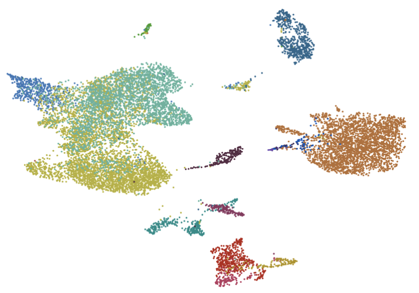
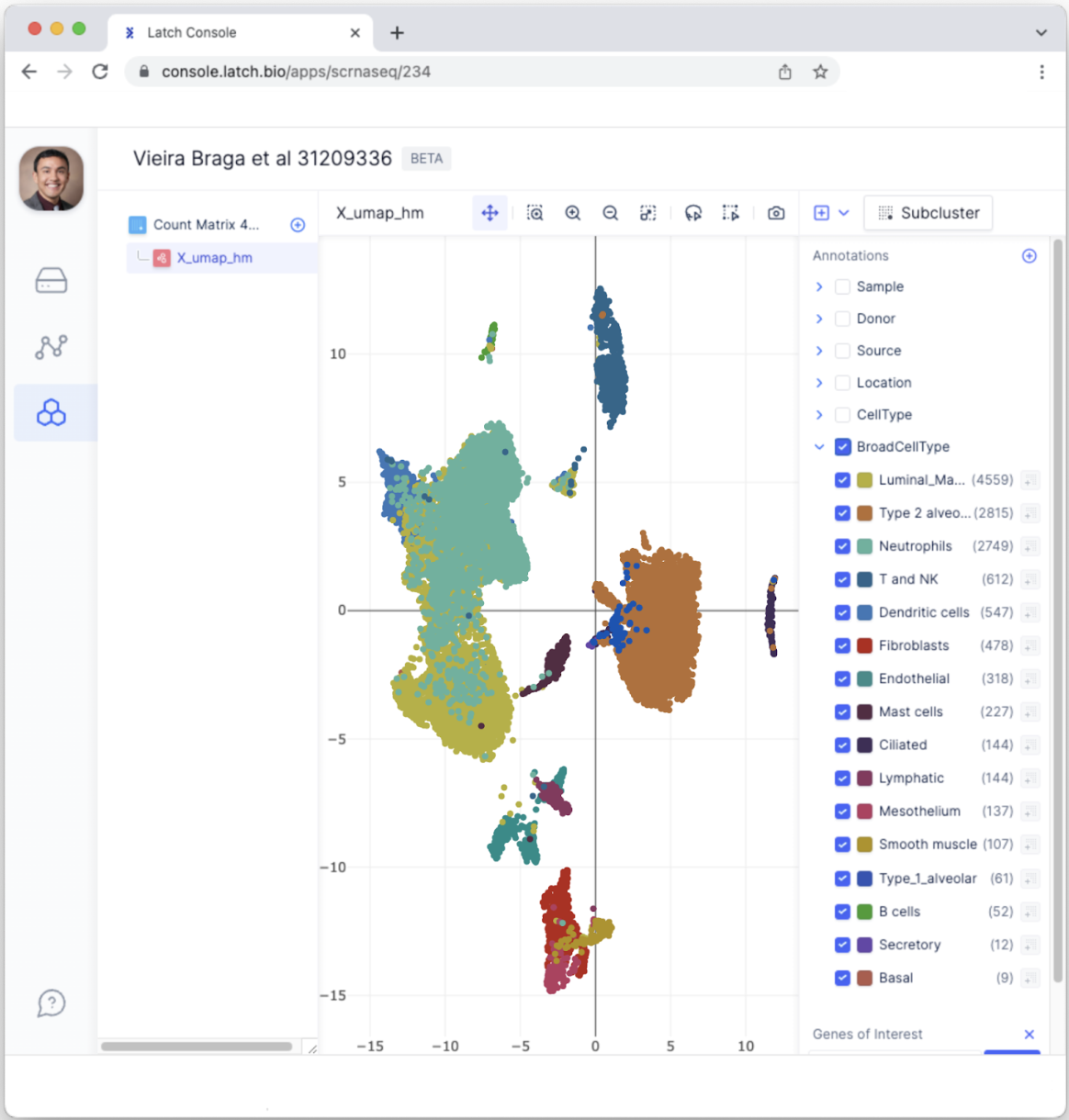
- To visually inspect the single-cell sequencing results, click on the “X_umap_hm” button on the left sidebar.
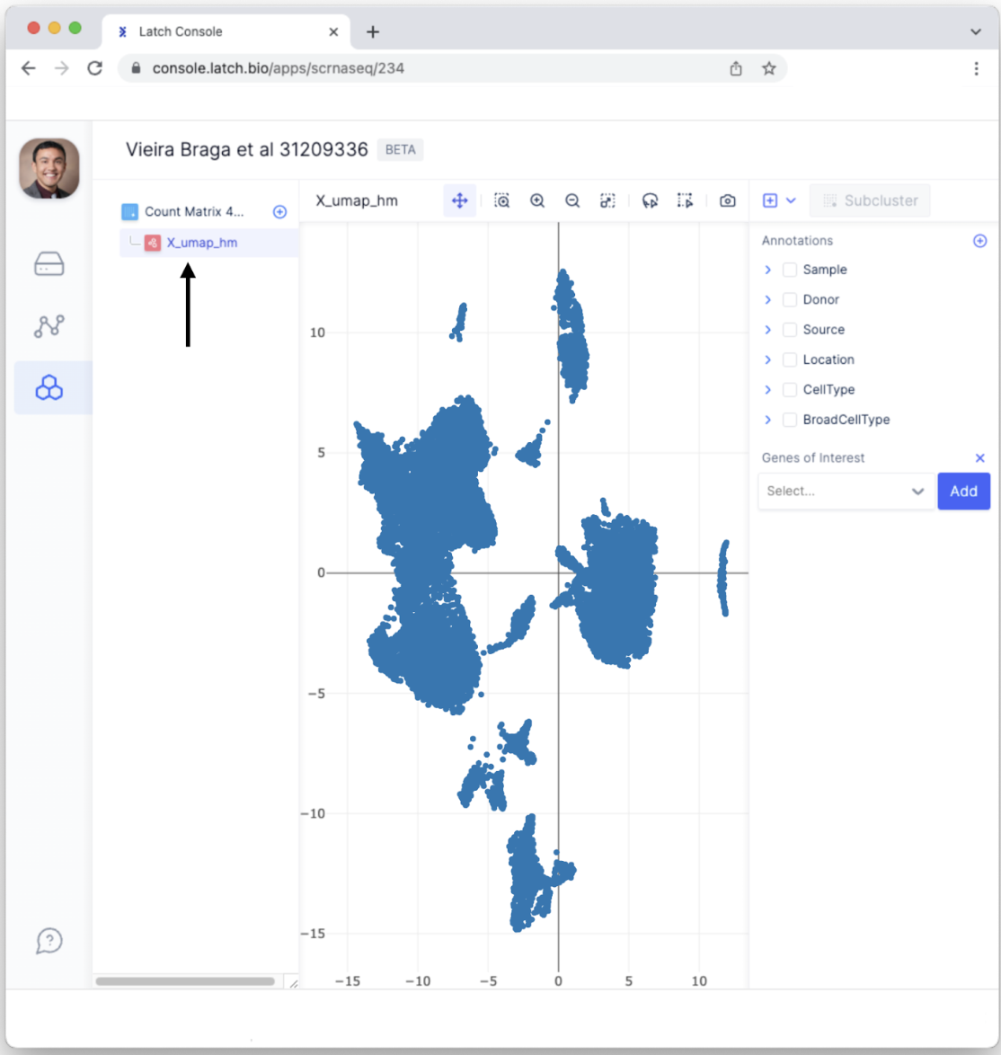
- Each dot represents a single cell. Having each cell colored the same isn’t the most informative. Select different Annotations to color data points according to categorical variables. For example, select “BroadCellType” to color each data point according to a cell type such as Neutrophils, Fibroblasts, etc.
Quality control filter data
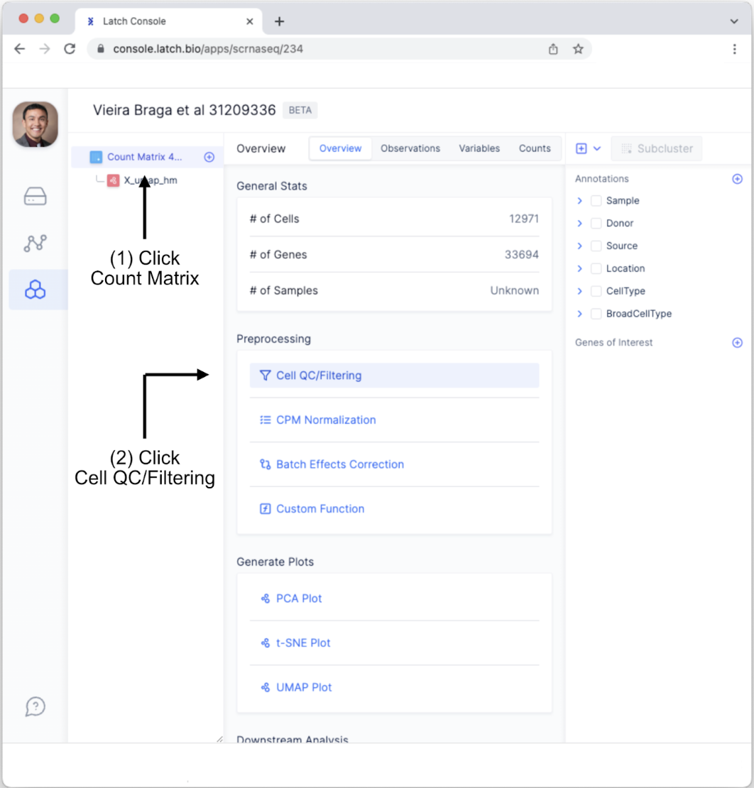
- Go back to the “Count Matrix 4…” tab and click “Cell QC/Filtering” under “Preprocessing” in the “Overview” tab.Doing so will change the display area. You will see different variables for conducting quality control. These include counts per barcode, the number of genes per barcode, the percent of mitochondrial genes per barcode, and the percent of ribosomal genes per barcode. The distribution of each is depicted. Selecting a range can be done using two methods:
- Manually change the numerical range using the text boxes.
- Click on a graph then click and drag the white rectangle to change the included range.
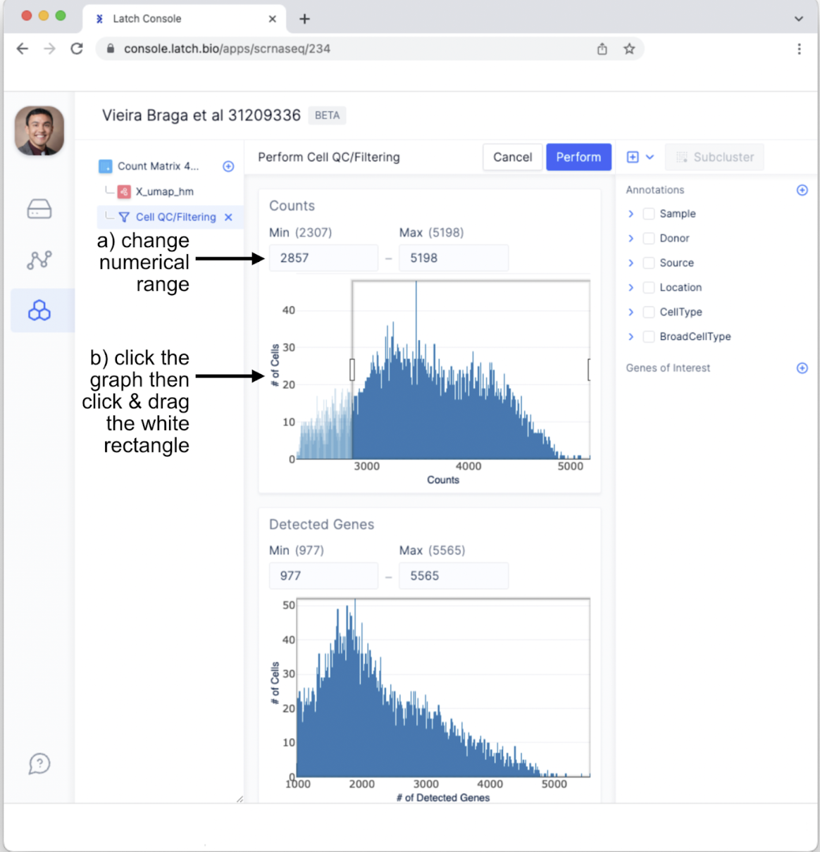
- For the purposes of this tutorial, set the max counts to 4,750 and keep the other ranges the same. Different datasets will likely, if not certainly, require using different thresholds. Tailor these parameters for your data and research questions.
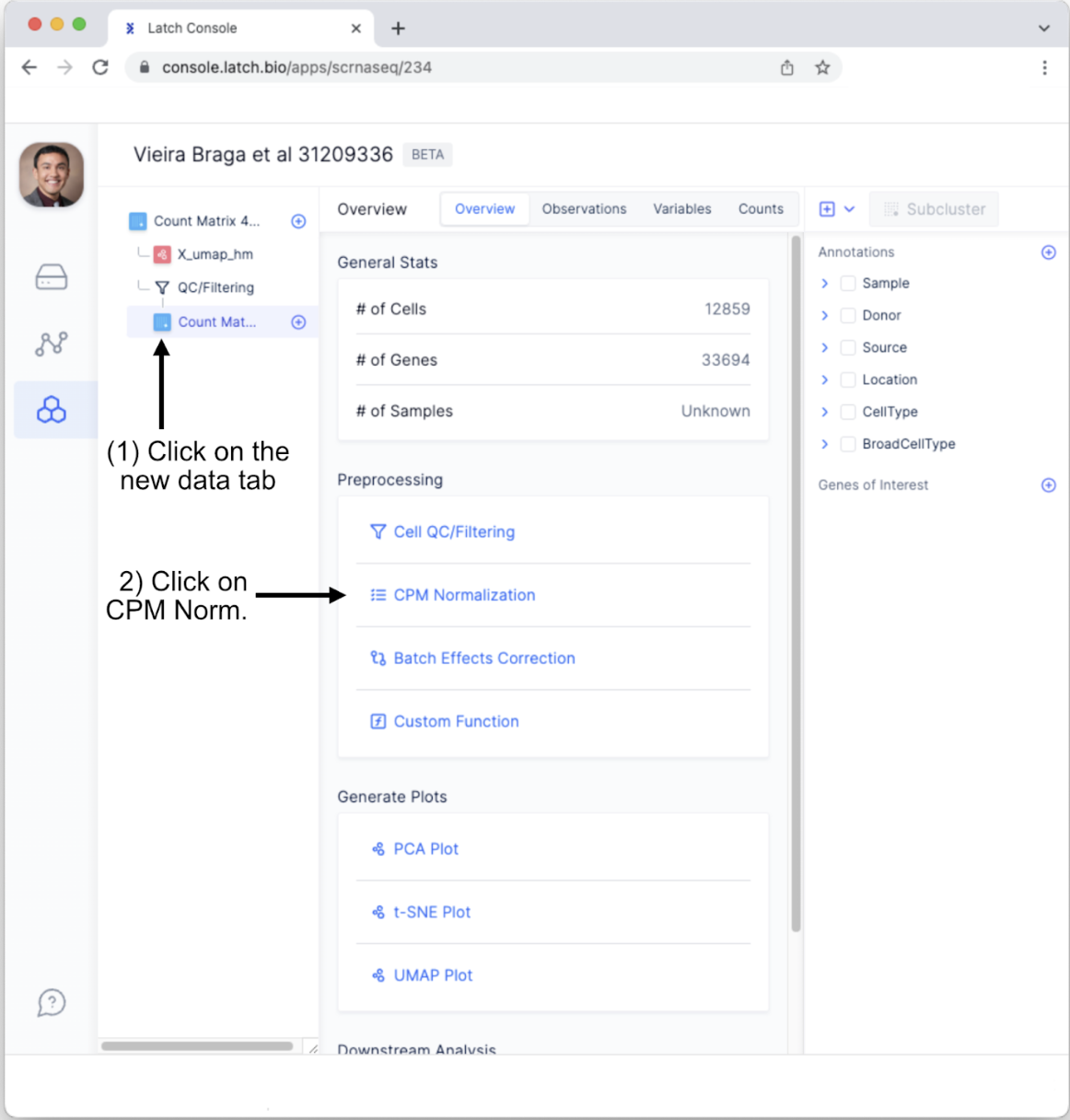
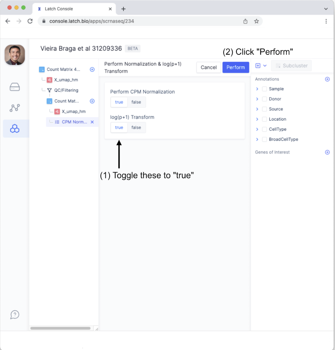
- Toggle “Perform CPM Normalization” and “log(p+1) Transform” to be “true.” Next, click the “Perform” button.
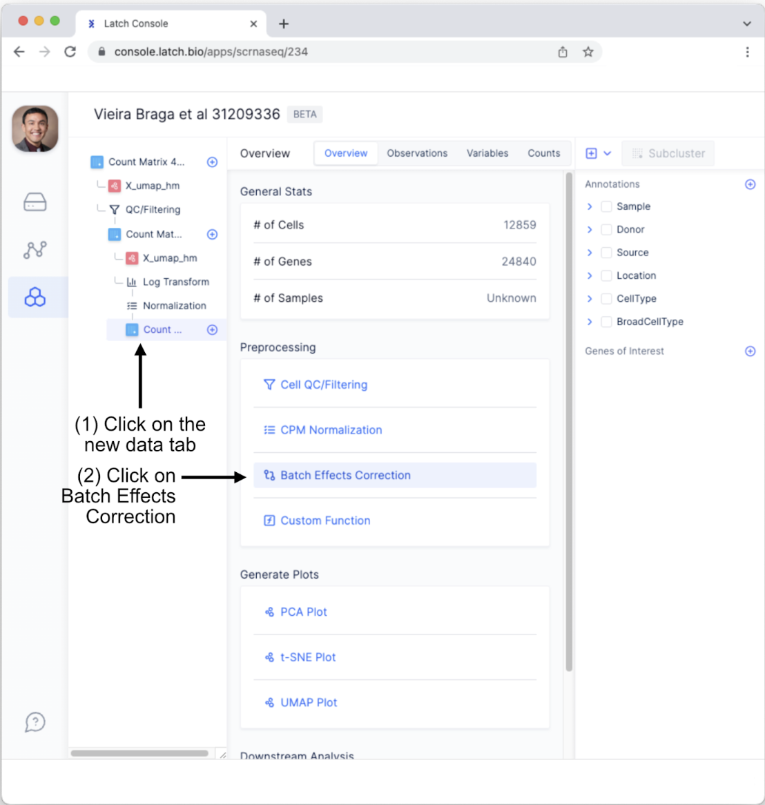
- We will conduct one more quality control measure, the “Batch Effect Correction Method.” To do so, Click on the newly generated “Count Matrix” tab and select “Batch Effects Correction.” Note, we are not covering the “Custom Function” for preprocessing; however, this powerful option enables users to create custom preprocessing steps using minimal coding.
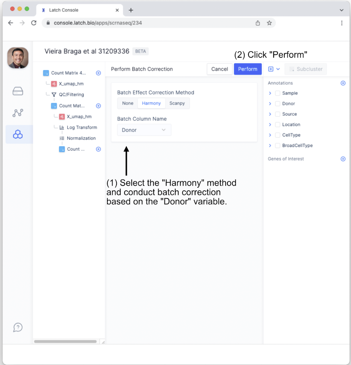
- Select the “Harmony” batch effect correction method. In this case, let’s conduct batch effect correction on the Donor variable to help account for person-to-person variation. Next, click the “Perform” button.
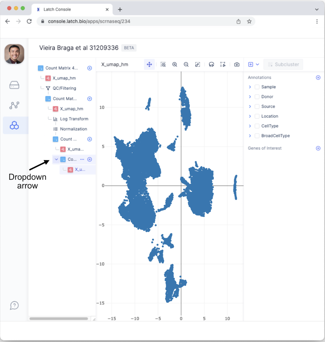
- This will bring up a new subtab. Click on “X_umap_hm” to view the post-processed results. If you do not automatically see the new tab, click the dropdown icon that appears when the mouse hovers over “Count Matrix.”
Sub-cluster within a cell type
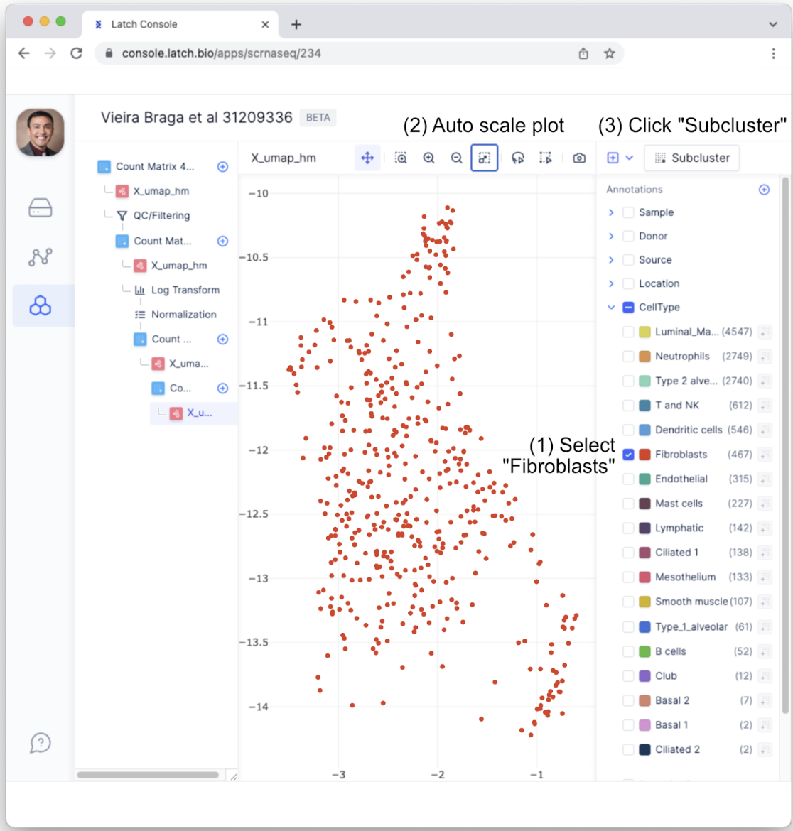
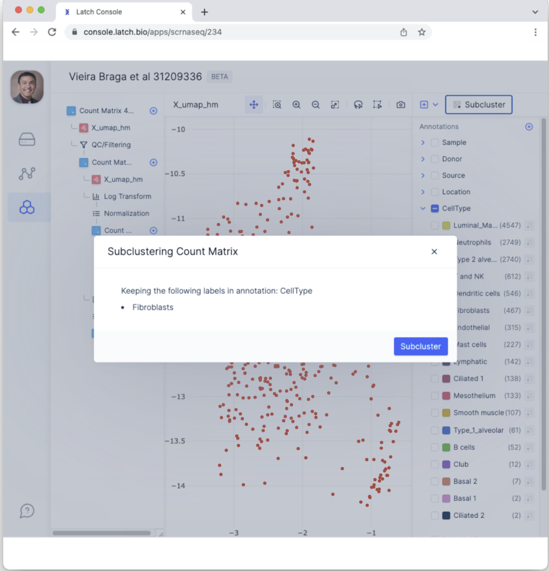
- Next, we may want to determine if subclusters within a cell type exist. To do so, we will first need to select a specific annotation. For this example, within the “CellType” annotation, select “Fibroblasts.” As a review, fibroblasts are a major constituent of connective tissues by mediating cell-cell adhesion. To get a better plot of the Fibroblast cells, click “Auto Scale Plot.” Then, click on the “Subcluster” button.
- This will bring up a menu that ensures the desired annotations have been selected. Confirm the correct annotation—Fibroblasts CellType—has been selected and then select “Subcluster.
- This will generate a new tab with data from only Fibroblasts. To conduct clustering analysis among Fibroblasts, click the”+” button in the top right and select “Run Leiden Clustering.”
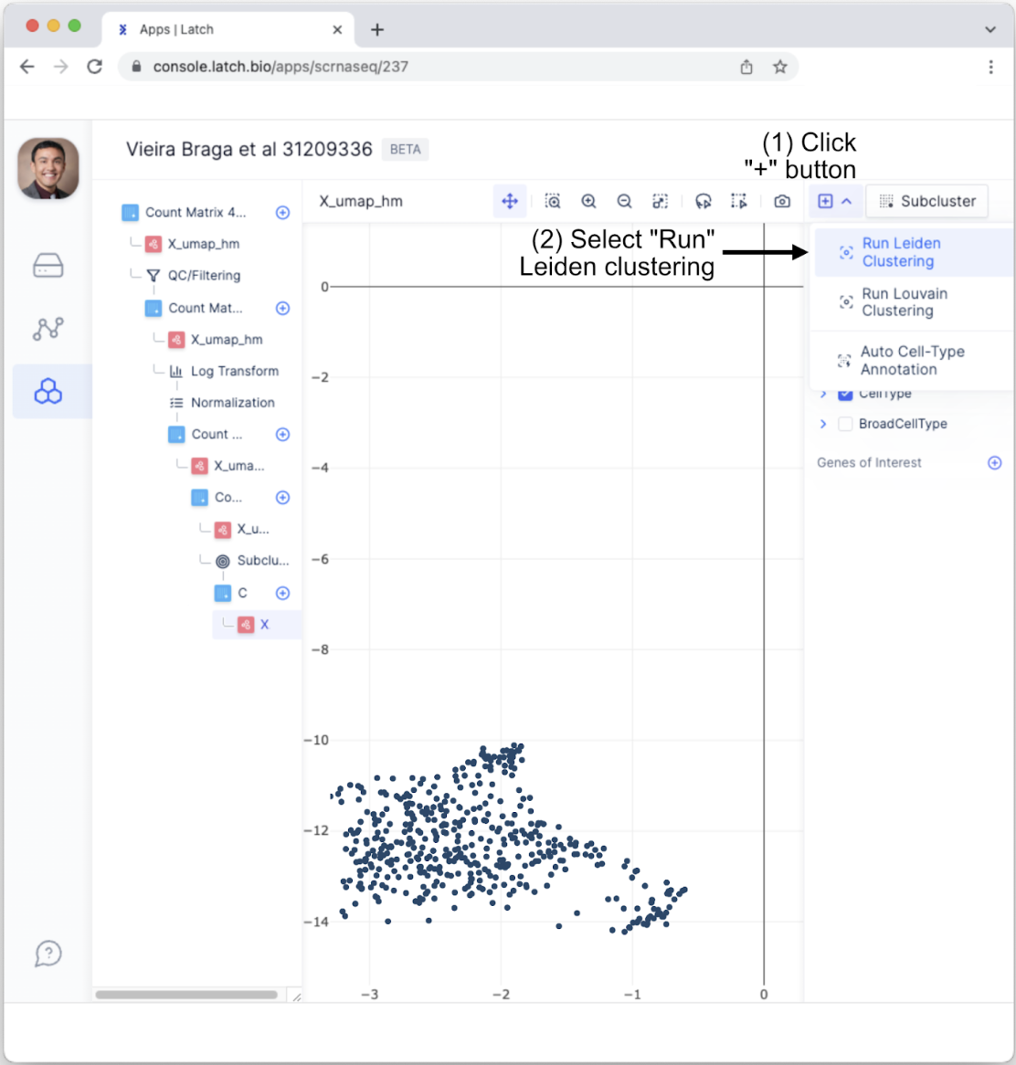
- This will bring up a menu that allows users to fine-tune parameters such as the level of resolution and the number of iterations. For the purposes of this tutorial, use the default options and click “Run Leiden.”
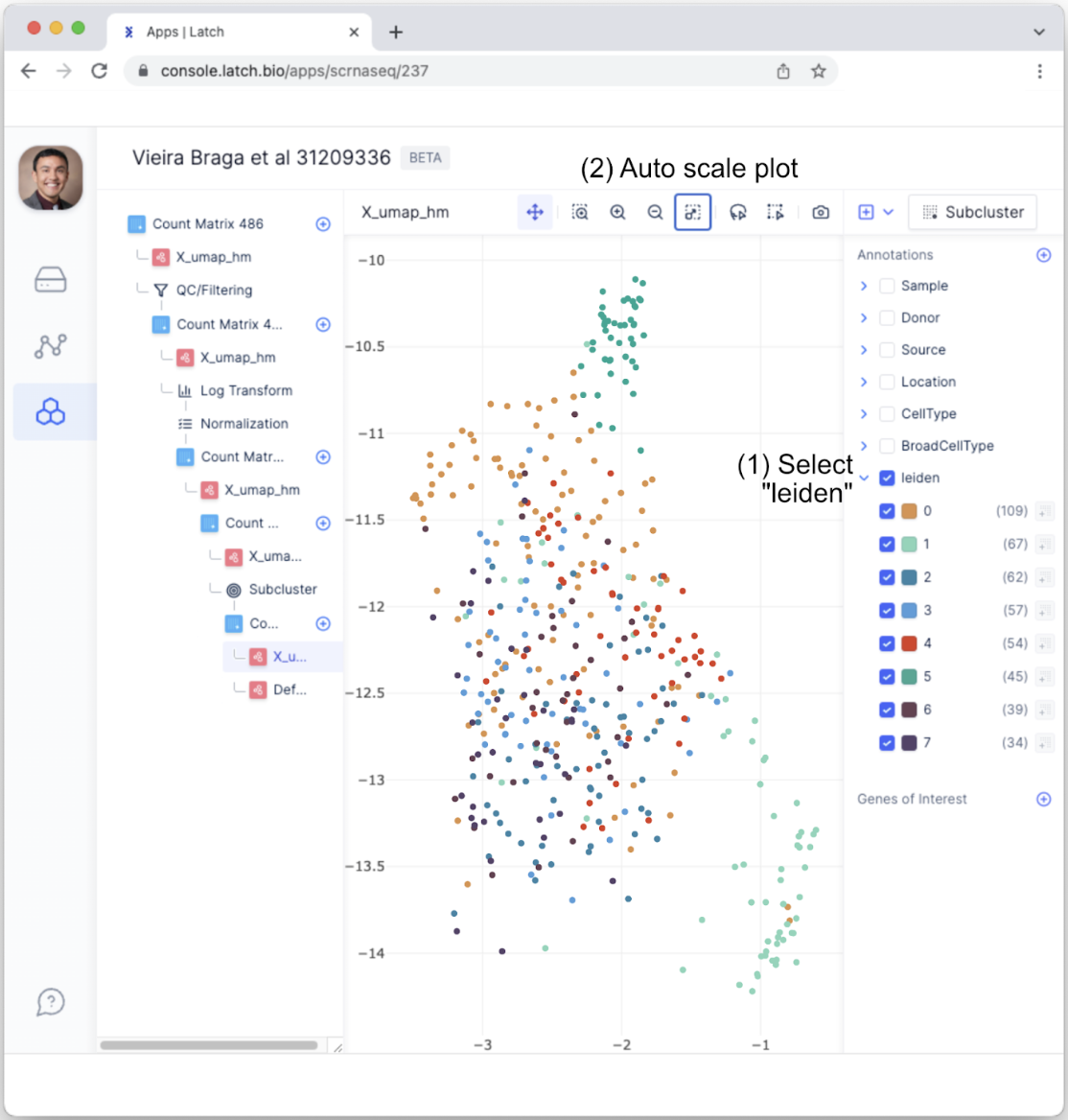
- A new annotation, “leiden,” will appear in the Annotation tab. Select the “leiden” tab and auto-scale the plot. Each number, zero through seven, represents a distinct subcluster among Fibroblasts. In other words, there are seven subtypes of Fibroblasts.
Differential expression analysis between subclustered cell types
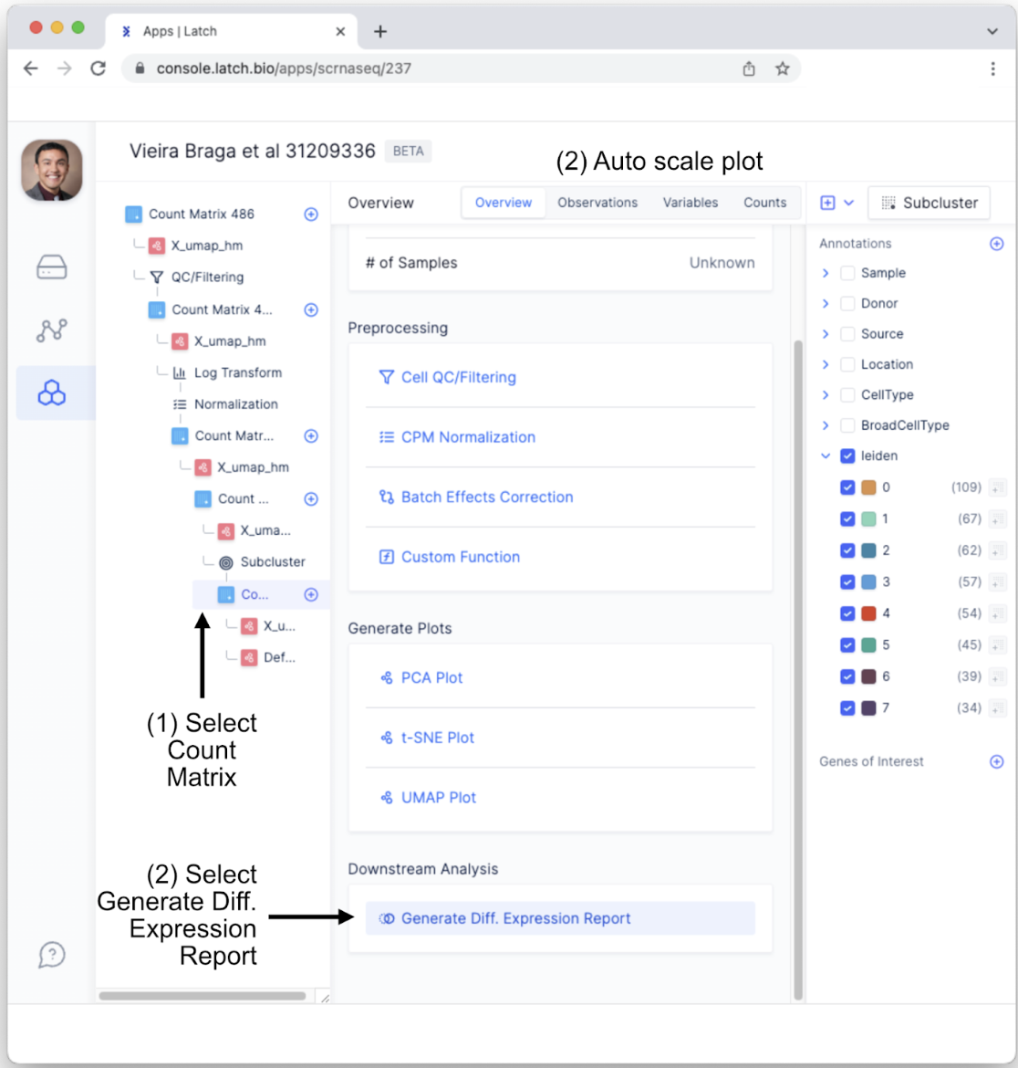
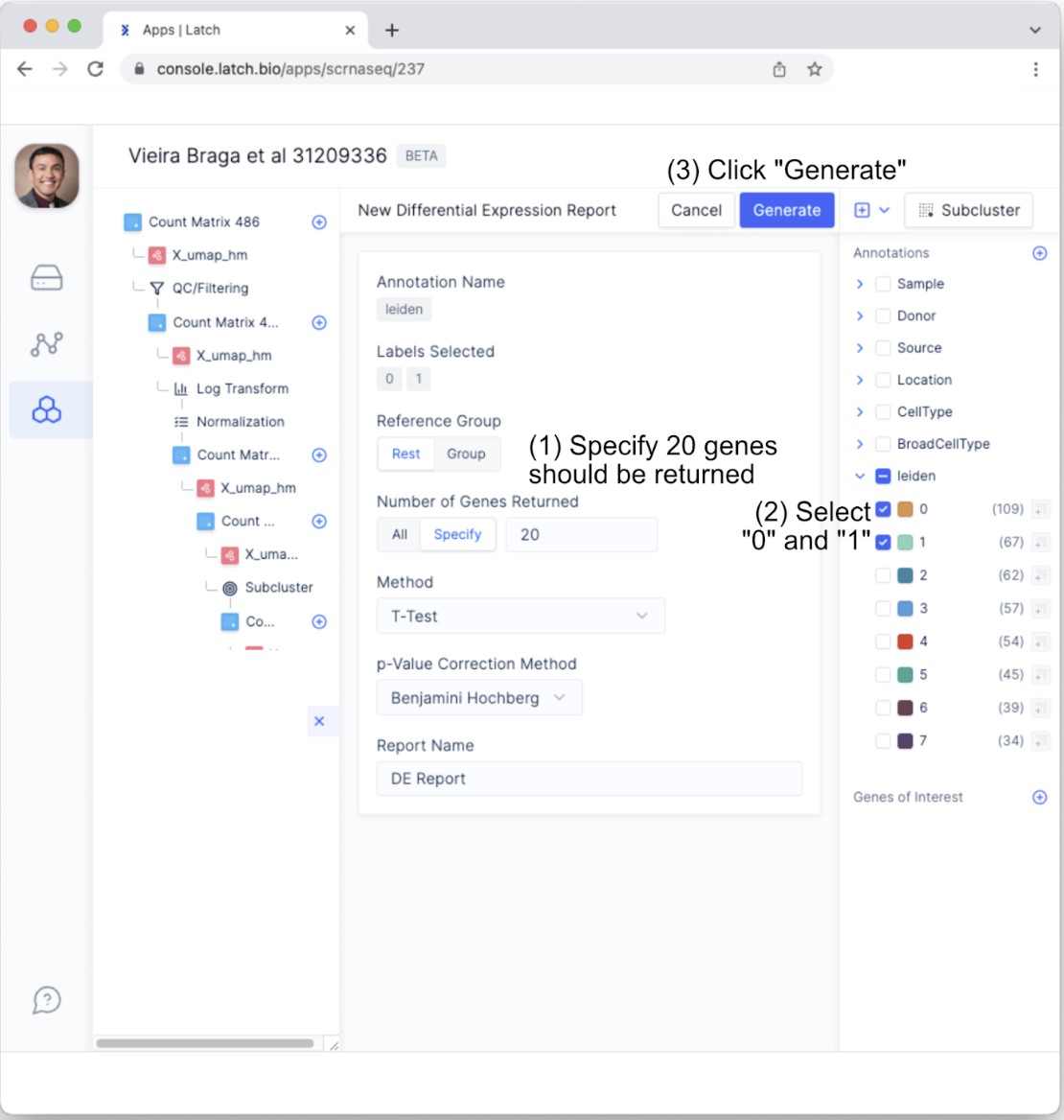
- To conduct differential expression analysis between subclustered cell types, return to the “Count Matrix” tab in the left sidebar. Scroll down to the bottom of the display and underneath “Downstream Analysis” select “Generate Diff. Expression Report.”
- This will bring up customizable parameters for the differential expression analysis. For the purposes of this tutorial, change “Number of Genes Returned” to 20 by toggling to “Specify” and making sure the argument is set to 20. All other parameters will be maintained. Also, to see how genes from Leiden cluster 0 and cluster 1 differ from the other clusters using the Leiden algorithm, select only the “0” and “1” in the “leiden” annotation tab.
- This will generate a new tab with the differential expression report. Click on the new tab and examine the layout.
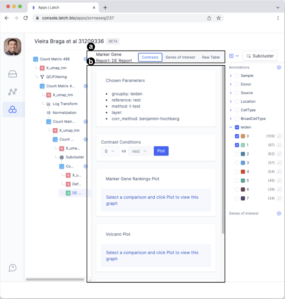
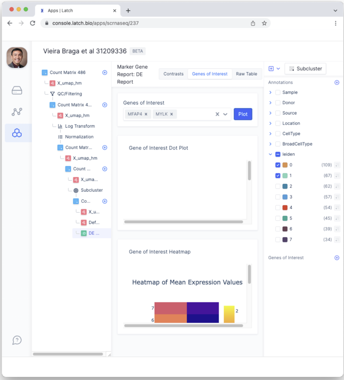
- The tabs have changed to “Contrasts,” “Genes of Interest,” and “Raw Table” and now represent different ways of exploring the differential expression report.
- This section provides a summary of the parameters chosen for differential expression analysis and facilitates making comparisons in the “Contrast Conditions” section.
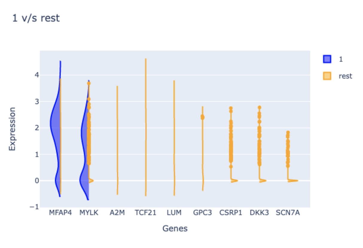
- To explore how leiden cluster 1 differs from the rest of the Leiden clusters, select “1” click the “Plot” button in the “Contrast Conditions” sections. In the “Marker Gene Rankings Plot” you will find that the expression of MFAP4 robustly differentiates cluster 1 from all other clusters.A violin plot will also be generated to facilitate examining the expression levels of each top-ranking gene.
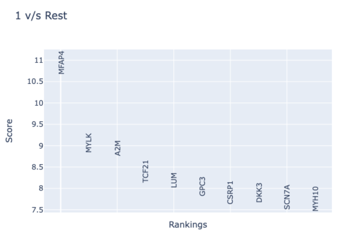
- Examination of MFAP4 function using NCBI reveals this gene encodes a microfibril-associated protein. Specifically, it is thought that this protein is located in the extracellular matrix protein and facilitates cell adhesion. It is therefore reasonable that Fibroblasts express MFAP4; however, it is informative that only a subpopulation of Fibroblasts does so.
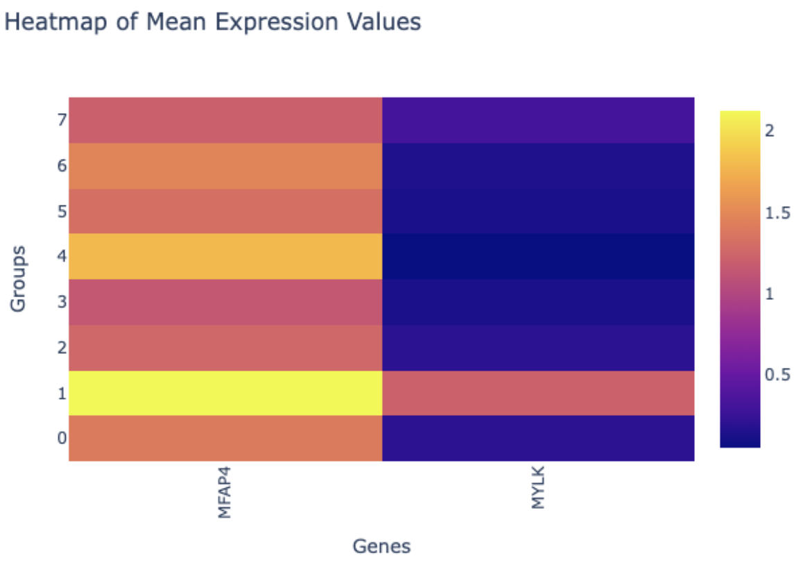
- Select the “Genes of Interest” tab to explore other ways of plotting select genes. For example, let’s focus on the top two genes MFAP4 and MYLK. Type “MFAP4” into the “Genes of Interest” bar and select the gene. Next, type “MYLK” and select the gene. Next, click the “Plot” button.This generates useful plots such as the heatmap of mean expression values that provide easy-to-interpret results that demonstrate the expression of these two genes is higher in cluster 1 compared to the other clusters.