- Perform quality control and filtering to select cells for downstream analysis
- Perform normalization
- [Bonus] Add your own custom code for analyses not available out of the box
- Visualize gene expression on embeddings (PCA, UMAP, tSNE)
- Identify marker genes between clusters within the neighborhood embeddings
- Dynamically generate differential expression across cell types and tissues.
Mental Model
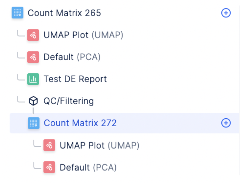
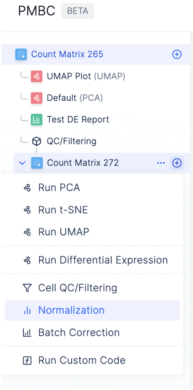
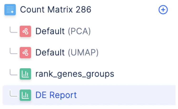
The Latch Browser allows scientists to iteratively transform their count matrix through a series of well defined steps that are easy to reason about and recover. Each of these steps ingest some desired count matrix and produce a new, modified value without modifying the original one. One can freely transform their matrices as composable chains of these “data mutations” without fear of losing intermediate steps. (Our “data mutations” are loosely inspired by the class of atomic operations used by database systems to perform safe transformations of data) For instance, looking at the left sidebar of the visualizer, we see that a new count matrix is created after the QC/ Filtering and Normalization step. In other words, the data mutations QC/Filtering and Normalization each results in a distinct, new child matrix.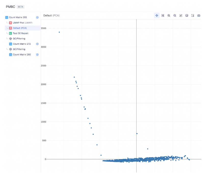
Standard preprocessing workflow
Currently, the single cell visualizer uses scanpy for all analysis steps. If there is a package that you would like us to support an additional package, send us a note at hannah@latch.bio!Quality Control
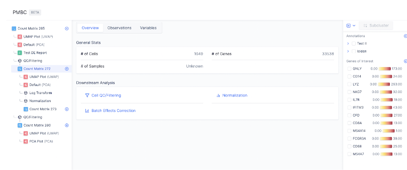
Before analyzing single-cell gene expression data, we must ensure that all cellular barcode data correspond to viable cells. One way to check the quality of the dataset is by viewing the PCA plot, as shown on the left hand side.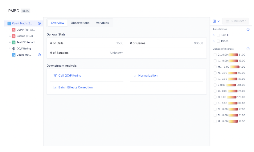
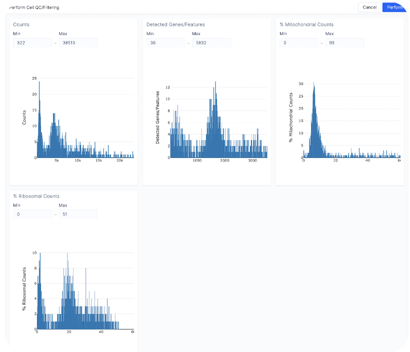
- Count depth: Min (322) - Max (15000)
- Detected genes/Features: Keep the same
- % Mitochondrial Counts: Min (0) - Max (20)
- % Ribosomal Counts: Keep the same
Normalization
We use counts per million (CPM) normalization for scaling count data to obtain correct relative gene expression abundances between cells. To start normalizing the dataset, select the plus sign next to the count matrix post-QC and choose Normalization.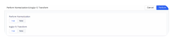
Bring-Your-Own-Code for Custom Analyses
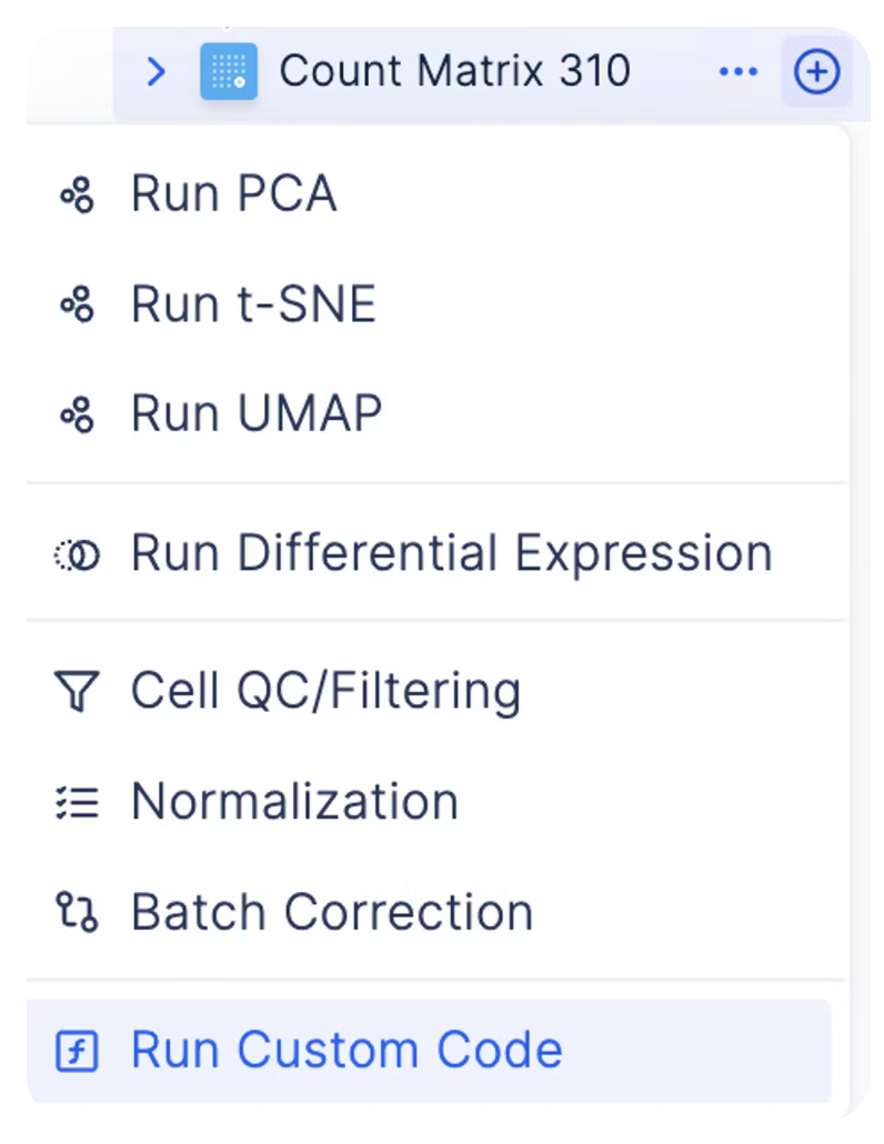
As every single cell dataset is unique, it may be desirable to run custom code to preprocess your data in addition to the existing functionalities on Latch. You can do so by clicking on the plus sign next to a count matrix and select plus icon Custom Code.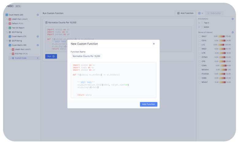
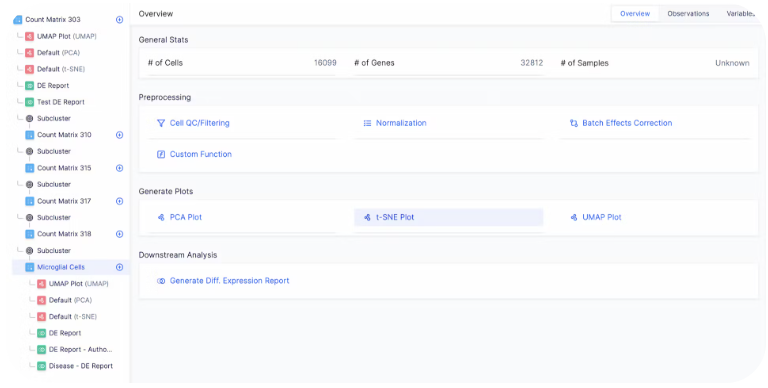
Downstream Analysis
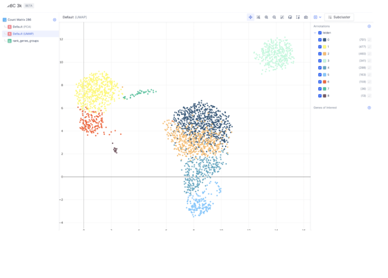
Generating the embedding graph
To create tSNE, UMAP, or PCA embeddings on the dataset, you can navigate to the desired count matrix and select the embedding of your choice.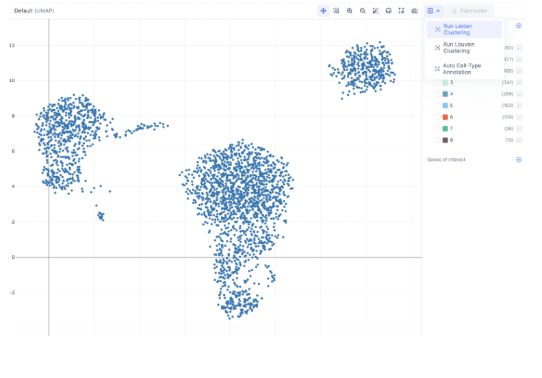
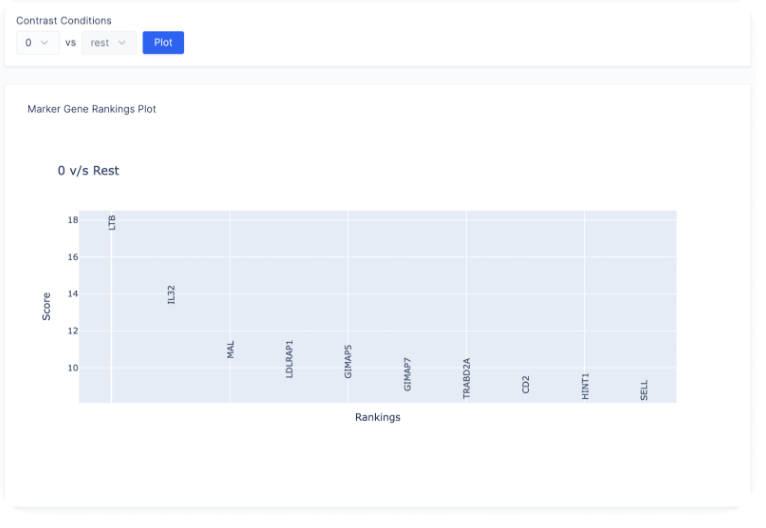
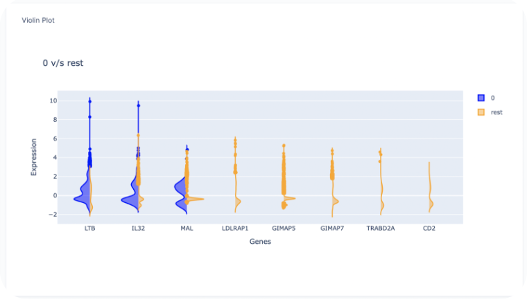
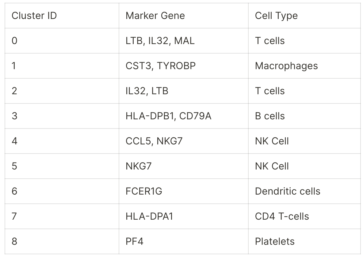
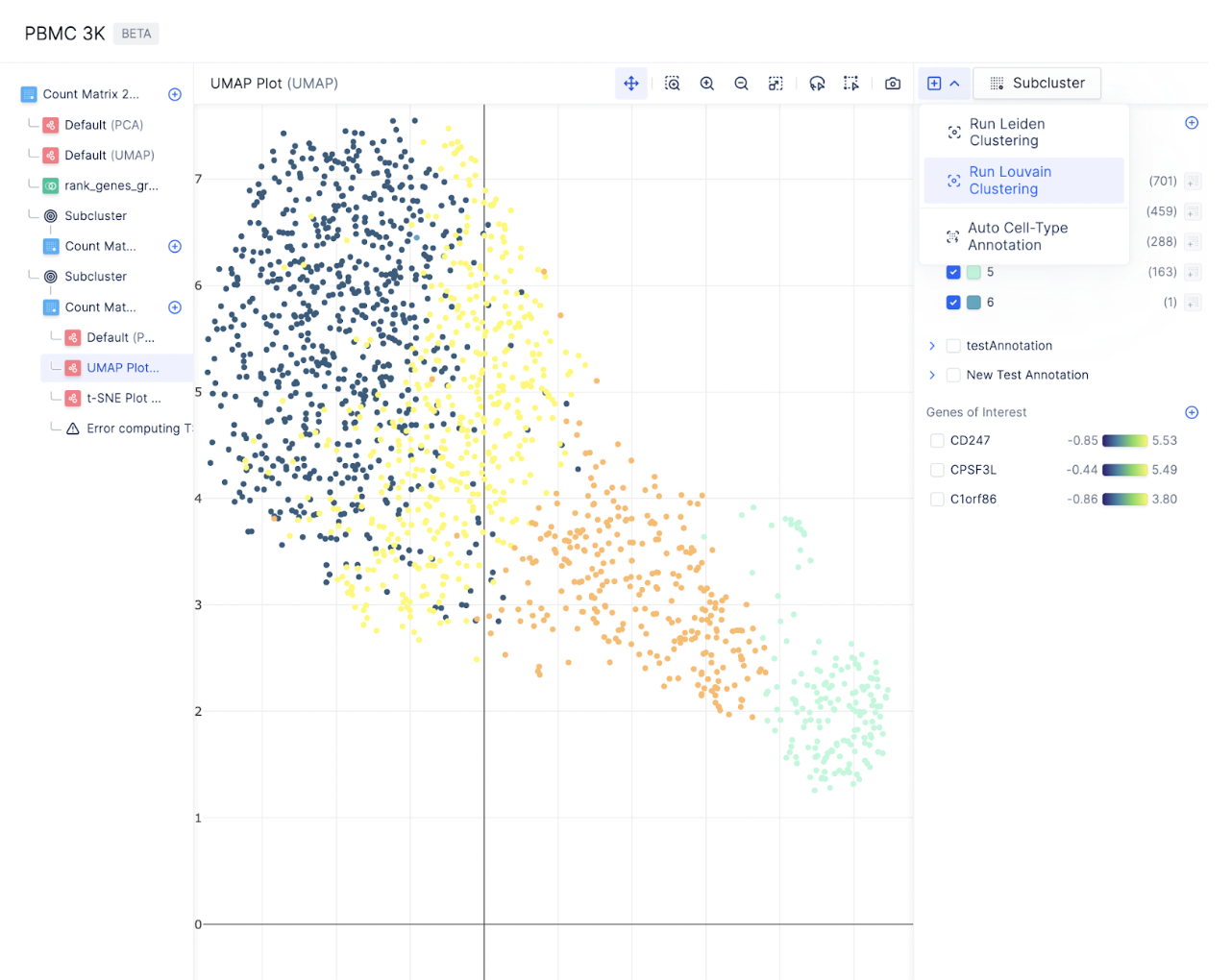
Finding Marker Genes
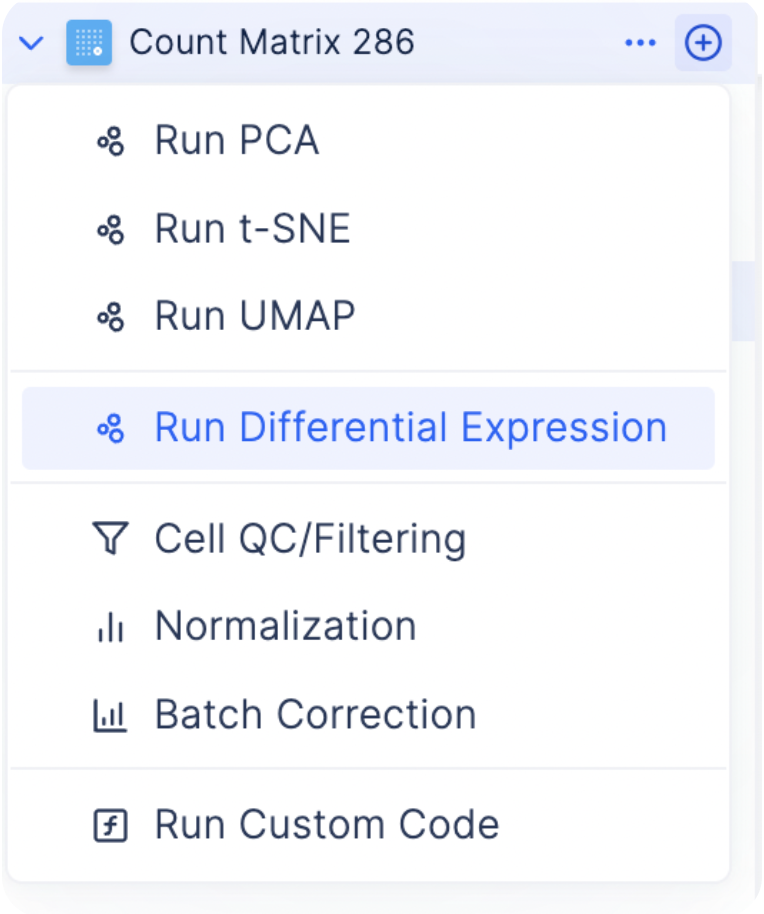
To find the most differentially expressed genes in each group, select the plus icon next to each count matrix and choose Run Differential Expression.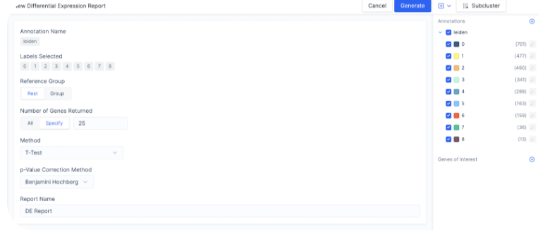
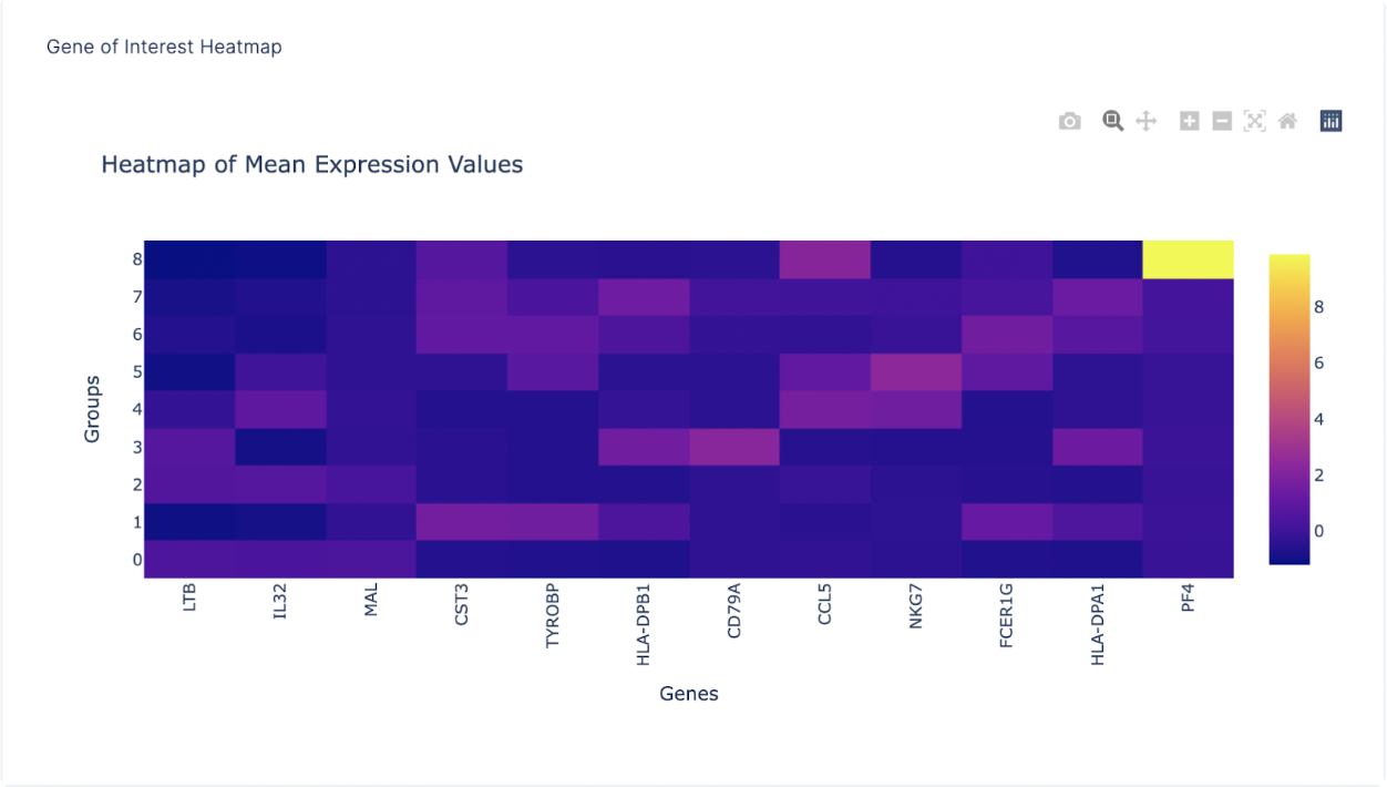
Heatmap of Gene Expression
After finding a list of ranked marker genes, we can also compute a dot plot and heatmap of mean expression values in the Gene of Interest Tab by inputting the list of genes of interest.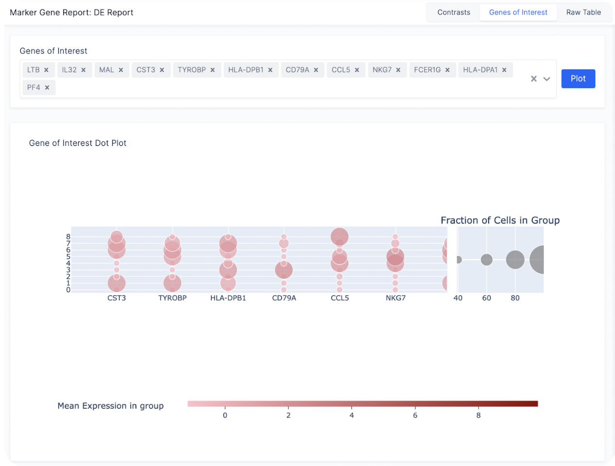
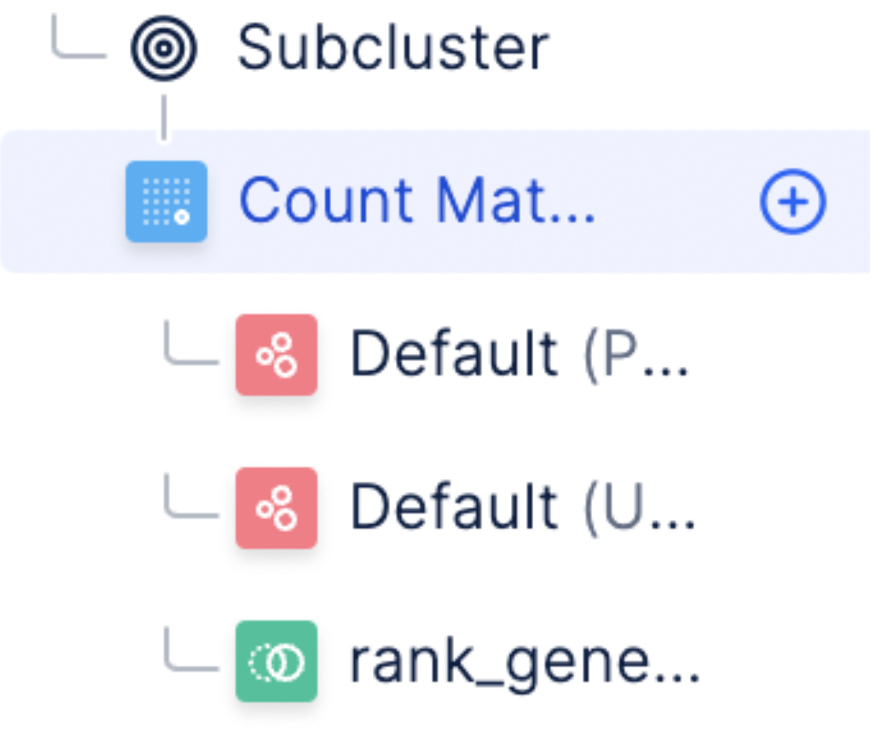
Subsetting Cell Clusters
For a large number of cells, it is often helpful to subset a cluster of specific cell type and re-perform Louvain to identify cell subtypes. To subset a group of cells, first toggle the annotations on the right sidebar to display all the cells you want to subset and select Subcluster.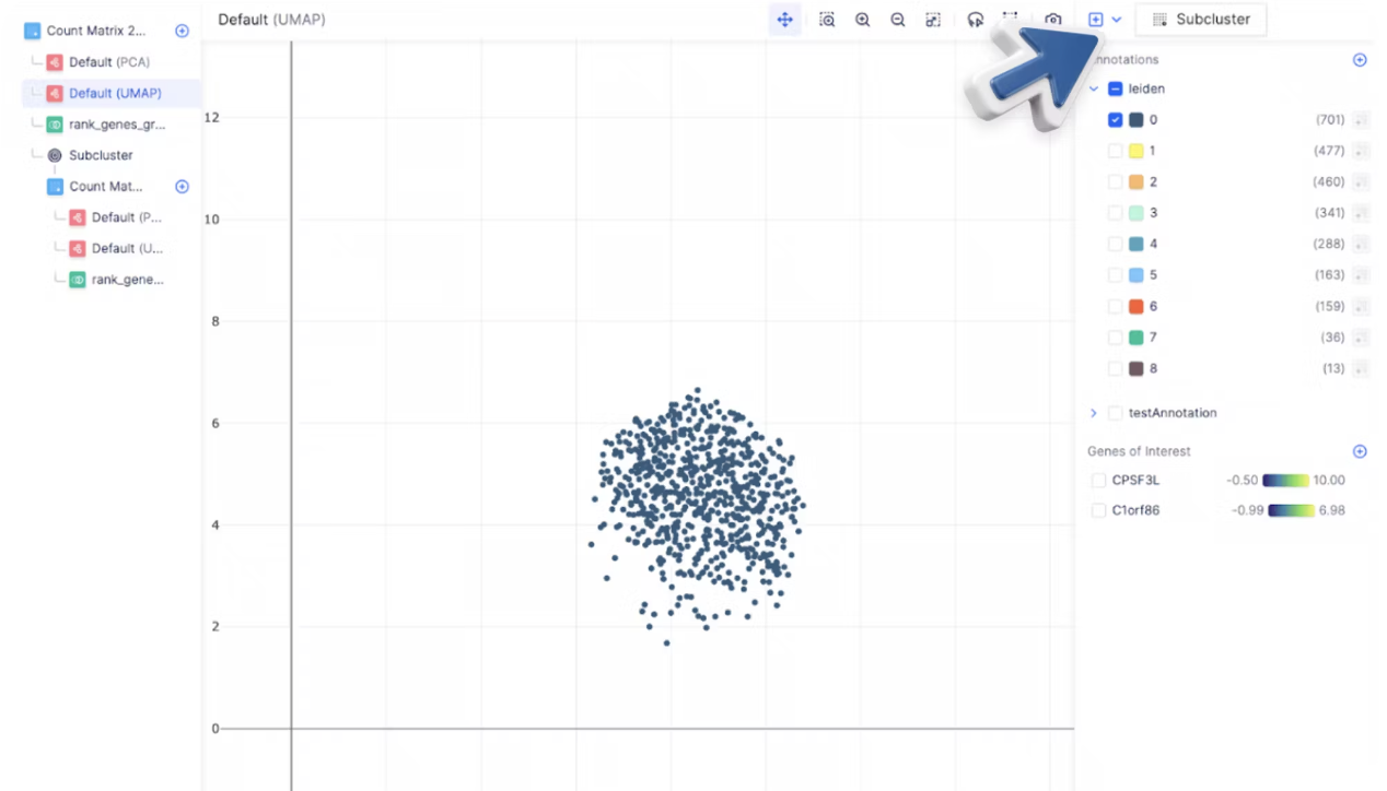
Key Takeaways
- With Pollock, you have learned how to:
- Perform quality control and filtering to select cells for downstream analysis
- Perform normalization
- [Bonus] Add your own custom code for analyses not available out of the box
- Visualize gene expression on embeddings (PCA, UMAP, tSNE)
- Identify marker genes between clusters within the neighborhood embeddings
- Dynamically generate differential expression across cell types and tissues.
- Pollock’s model allows scientists to reiteratively analyze their single-cell data through a series of well-defined steps, where each step and the corresponding count matrix is always saved.
What’s Next
- Try out the single-cell visualizer here.
- Read our next tutorial to see how to replicate Nature’s paper: “Single cell RNA sequencing of human microglia uncovers a subset associated with Alzheimer’s disease” (Olah et. al, 2020)