Documentation Index
Fetch the complete documentation index at: https://wiki.latch.bio/llms.txt
Use this file to discover all available pages before exploring further.
Capabilities
Latch Plots has a built-in LLM capable of performing various tasks, from basic statistical analyses and visualizations in Python to building fully interactive applications.
To achieve this, we prompt engineered Claude 3 to:
Understand the different components of Latch Plots. This includes how to:
-
Create Python cells with interactive input widgets
-
Install any library and write any code for analyses
-
Use Text cells for displaying text-based responses to questions
-
Choose the correct cell based on the user-inputted prompt
-
Navigate to correct line numbers of target cell to fix errors
-
And more
Understand LPath APIs
All files and folders uploaded to Latch are stored in Latch Data, a remote data/ object store on Latch. The LLM knows how to read and write data from and to LData using Python’s LPath APIs. Understand the context of the existing Python notebook.
The LLM the has context of all current and previous cells in the notebook, including existing global variables, previously written code, and past prompts.
Focus on existing data frame in a notebook or files/folders on Latch Data
Every LLM prompt box includes an Attach button, allowing you to select one or more dataframes from your current notebook or files and folders stored on Latch Data. You can also attach instructional documents, such as analysis tutorials (e.g., scanpy), to provide context and guide the LLM’s analysis.
Examples
We walk through a few common examples of effective prompts to demonstrate how the LLM can be used in realistic biological flows.
Example 1: Generate Prism-like Dose-Response Curves
Below is a typical XY table from GraphPad Prism that records the responses between two groups (No Inhibitor vs. Inhibitor) against various agonist concentrations. Our end goal is to create a graph set of two dose-response curves.
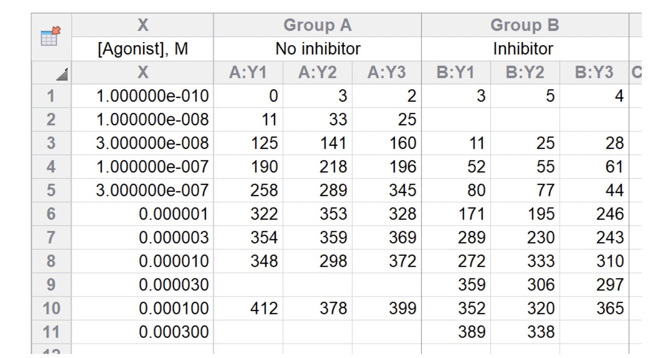
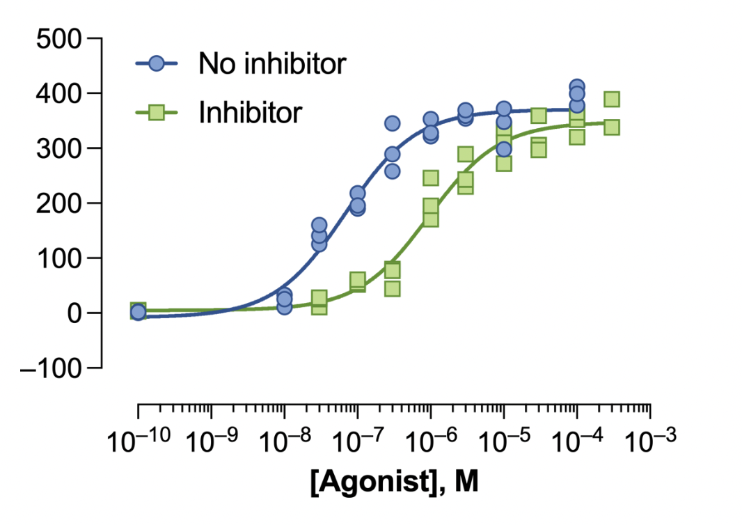 First, to make it easier to work with, we transformed the GraphPad Prism XY table format to a long table format with columns such as sample names, replicates, condition (Inhibitor vs. no inhibitor), agonist concentration, and dose-response values.
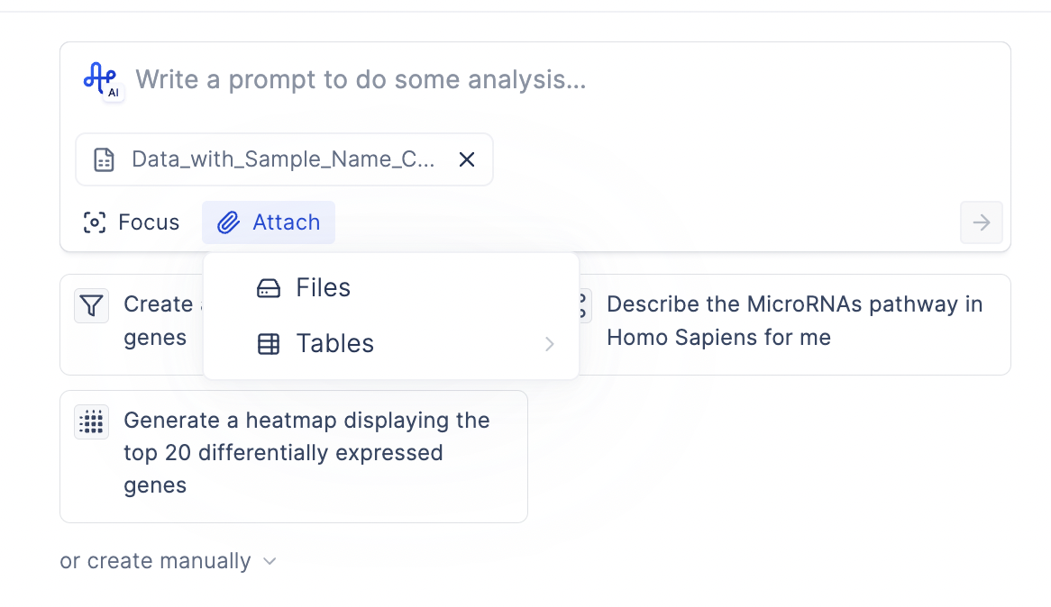
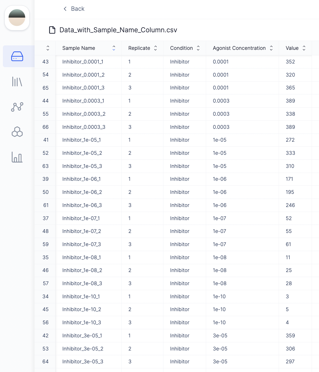 To upload this file to Plots, click Attach → Files → Drag and drop the file to the Latch data browser. Then click Select.
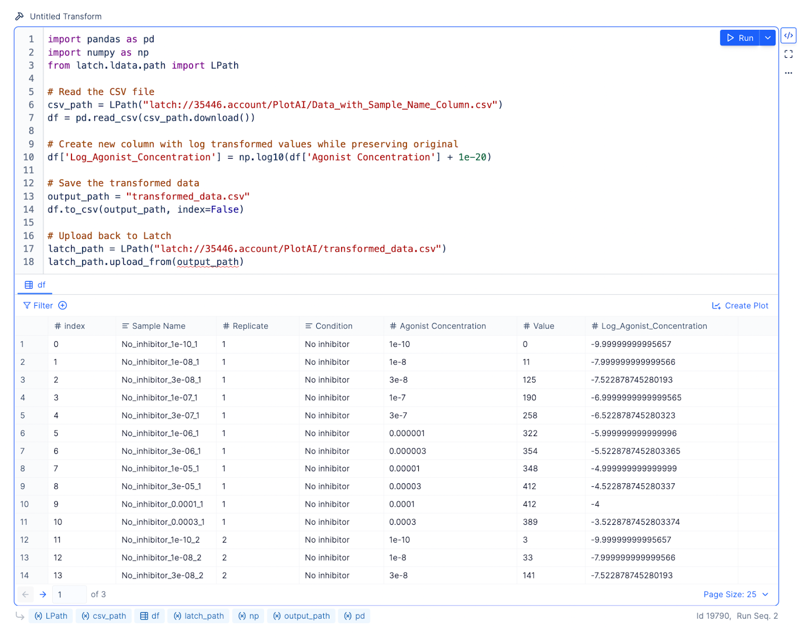
 Because the agonist concentrations span many orders of magnitude, we want to log-transform these concentration values before performing nonlinear regression.
Prompt: Log transform the Agonist Concentration column. Store the results in a new column called Log_Agonist_Concentration.
Result: The LLM will write Python code using LPath APIs to download the remote file from Latch Data and pandas to read the local file into a data frame for analysis. Every data frame on Latch Plots comes with a default table viewer, so you can inspect what the results look like.
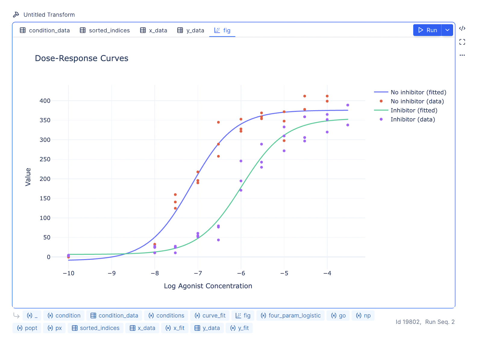
 Prompt: Create a plot with two dose-response curves, one for inhibitor and one for no inhibitor. Log agonist concentration is on the X axis, and Value is on the Y axis. Use the Variable slope (four parameters) model for logistic regression.
Result: The LLM will write code using curve_fit from the scipy.optimize library to create the dose-response curves.
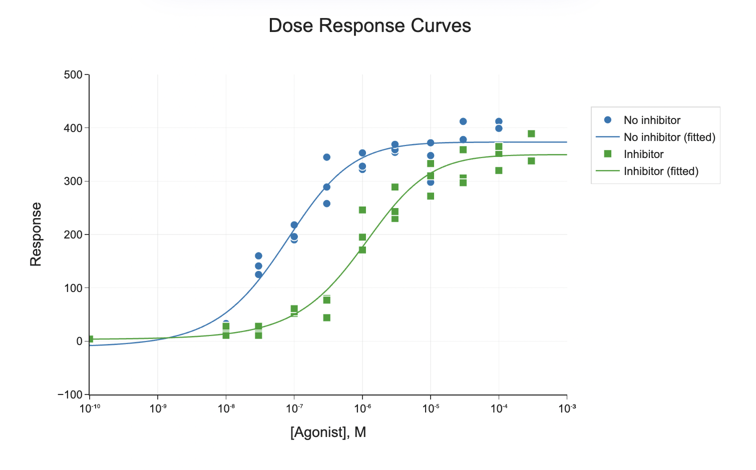
 You can further prompt the LLM to update the aesthetics of the graph to mimic the GraphPad Prism style.
 Prompt: The x-axis, labeled ‘[Agonist], M’, should be on a logarithmic scale ranging from 10^-10 to 10^-3, and the y-axis, labeled ‘Response’, should range from -100 to 500. Plot two datasets: ‘No inhibitor’ (blue circles) and ‘Inhibitor’ (green squares). Add smooth fitted curves to both datasets, with blue and green colors matching the markers. Include a legend in the top left corner with corresponding symbols. Use solid lines for the fitted curves, simple fonts, and minimal gridlines for a clean presentation.
 When comparing groups, adding statistical annotations to plots can be helpful. statsannotation is a robust Python library that simplifies this process by calculating p-values and adding annotations for various statistical tests (using scipy.stats), including:
-
Mann-Whitney
-
t-test (independent and paired)
-
Welch’s t-test
-
Levene test
-
Wilcoxon test
-
Kruskal-Wallis test
-
Brunner-Munzel test
Instead of writing custom functions and manually adjusting aesthetics, it’s recommended you install statsannotation and prompt the LLM to use it directly.
Prompt: Install the statsannotation library.
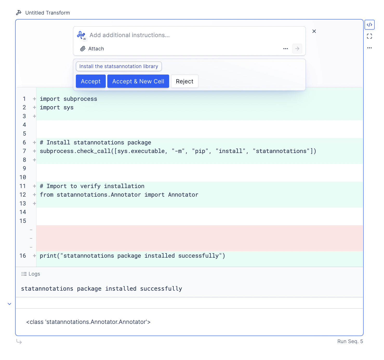 Next, we want to provide the LLM with the context on how to use the library. To do so, we can download the README.md from the library’s GitHub and attach it as a file to the LLM. Confirm that the document’s context is added by asking the LLM to provide a summary of the library.
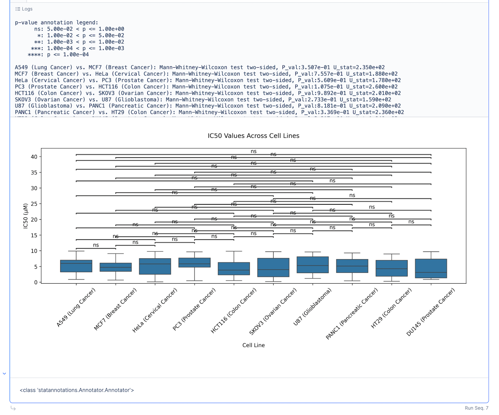
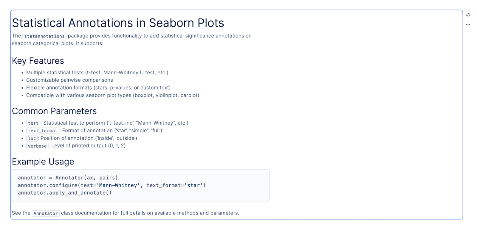 Prompt: Use the statsannotations library to create box plots of IC50 (µM) across different Cell Lines.
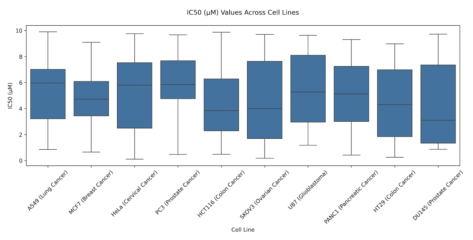
For the first pass, the plot generated can be cluttered.
 Prompt: Hide the non-significant annotations.
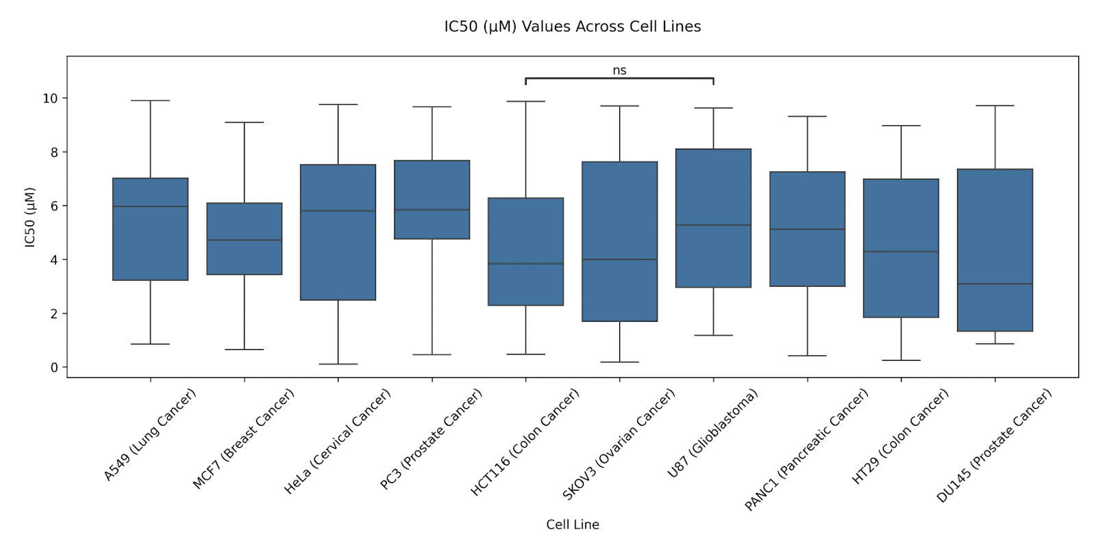
 You can also explicitly specify pairs to compare between.
Prompt: Only show the statistical annotation between “HCT116 (Colon Cancer)” and “U87 (Glioblastoma)”.
 Next, we walk through a more advanced examples of common steps in single-cell analysis, using the paper Repeated peripheral infusions of anti-EGFRvIII CAR T cells in combination with pembrolizumab show no efficacy in glioblastoma: a phase 1 trial by Bagley et. al
We selected this paper because it demonstrates advanced single-cell analysis workflows, including dataset integration with metadata, batch processing across samples, cell type annotation (automatic or manual), and generating statistical plots to compare gene expression levels pre- and post-treatment.
These workflows are common in studies involving multiple treatments and patient cohorts but are more complex than standard single-cell analyses like PBMC3K.
This complexity provides an opportunity to stress test LLMs and identify prompts that perform well.
Prompt:
You are working with a dataset stored on Latch Data, where:
The attached dataset folder is structured into subfolders named GSMXXXX (e.g., GSM7770561), each representing a sample.
Within each sample folder:
-
If .mtx files (e.g., files ending with matrix.mtx.gz, barcodes.tsv.gz, and features.tsv.gz) are present, the folder represents a valid single-cell dataset. If no .mtx files are found, disregard the folder.
-
Additionally, you have a SraRunTable.csv file in the same location containing metadata for these samples. The relevant columns from the CSV are source_name, time, tissue, and treatment.
Your task is to:
-
Use LPath to access the data stored on Latch.
-
Download and process only valid single-cell samples (those containing .mtx files).
-
Use scanpy to read these samples and combine them into a single AnnData object.
-
Integrate the metadata (source_name, time, tissue, treatment) into the combined AnnData object.
-
Save the combined AnnData object for downstream analyses.
Follow best practices in the Scanpy tutorial provided.
Result:
The LLM was able to use LPath API successfully to check for folders with the correct sample names, download them, and read them into an adata object using Scanpy. It was also able to inspect the SraRun.csv downloaded from Sequence Read Archive, and adding the appropriate metadata to the obs layer for each adata per sample. Finally, it merged all H5ADs into one big adata object, with sample ID being a column in the obs layer.
import os
import subprocess
import sys
from pathlib import Path
from typing import List, Dict, Optional
import pandas as pd
import numpy as np
from latch.ldata.path import LPath

# Install required packages
subprocess.check_call([sys.executable, "-m", "pip", "install", "scanpy"])
import scanpy as sc

# Check if combined data exists locally
if os.path.exists("combined_data_patients_all.h5ad"):
    print("Found existing combined data file. Loading...")
    combined = sc.read_h5ad("combined_data_patients_all.h5ad")
    print(f"Loaded combined AnnData object: {combined.shape[0]} cells, {combined.shape[1]} genes")
else:
    # Function to check if a directory contains files ending with required suffixes
    def is_valid_sc_directory(dir_path: LPath) -> bool:
        """Check if directory contains files ending with required suffixes"""
        files = list(dir_path.iterdir())
        required_suffixes = ['matrix.mtx', 'barcodes.tsv', 'features.tsv']
        return all(any(f.path.endswith(suffix) or f.path.endswith(f"{suffix}.gz") for f in files) for suffix in required_suffixes)

    # Function to process a single sample
    def process_sample(sample_dir: LPath, sample_id: str) -> Optional[sc.AnnData]:
        """Process a single sample directory and return AnnData object"""
        try:
            # Create a temporary directory for this sample
            temp_dir = Path(f"/tmp/{sample_id}")
            os.makedirs(temp_dir, exist_ok=True)

            # Download and rename files
            for file in sample_dir.iterdir():
                if 'matrix.mtx' in file.path or 'barcodes.tsv' in file.path or 'features.tsv' in file.path:
                    # Download with original name
                    local_path = temp_dir / file.name()
                    file.download(local_path)

                    # Rename to standard 10x names
                    new_name = None
                    if 'matrix.mtx' in file.path:
                        new_name = 'matrix.mtx.gz'
                    elif 'barcodes.tsv' in file.path:
                        new_name = 'barcodes.tsv.gz'
                    elif 'features.tsv' in file.path:
                        new_name = 'features.tsv.gz'

                    if new_name and local_path.exists():
                        os.rename(local_path, temp_dir / new_name)

            # Check if all required files exist
            required_files = ['matrix.mtx.gz', 'barcodes.tsv.gz', 'features.tsv.gz']
            if not all((temp_dir / f).exists() for f in required_files):
                print(f"Missing required files in {sample_id}")
                return None

            # Read the sample using scanpy
            adata = sc.read_10x_mtx(
                temp_dir,
                var_names='gene_symbols'
            )

            # Add sample ID to obs
            adata.obs['sample'] = sample_id

            return adata

        except Exception as e:
            print(f"Error processing {sample_id}: {str(e)}")
            return None

    # Read metadata
    sra_table_path = LPath("latch://35741.account/PlotAI/SraRunTable.csv")
    metadata_df = pd.read_csv(sra_table_path.download())

    # Keep only relevant columns
    metadata_subset = metadata_df[['Individual', 'Sample Name', 'source_name', 'time', 'tissue', 'treatment']]

    # Process all GSM directories
    gsm_dir = LPath("latch://35741.account/PlotAI/GSM")
    adatas = []

    for sample_dir in gsm_dir.iterdir():
        sample_id = sample_dir.name()
        print(f"Processing {sample_id}...")

        adata = process_sample(sample_dir, sample_id)
        if adata is not None:
            # Add metadata
            sample_metadata = metadata_subset[metadata_subset['Sample Name'] == sample_id].iloc[0]
            for col in ['Individual', 'source_name', 'time', 'tissue', 'treatment']:
                adata.obs[col] = sample_metadata[col]

            adatas.append(adata)

    # Combine all samples
    if adatas:
        print(f"Combining {len(adatas)} samples...")
        combined = adatas[0].concatenate(adatas[1:], join='outer')

        # Basic preprocessing
        sc.pp.filter_cells(combined, min_genes=200)
        sc.pp.filter_genes(combined, min_cells=3)

        # Save the combined object
        combined.write_h5ad("combined_data_patients_all.h5ad")

        # Upload to Latch
        output_path = LPath("latch://35741.account/PlotAI/combined_data_patients_all.h5ad")
        output_path.upload_from("combined_data_patients_all.h5ad")

        print(f"Combined AnnData object saved and uploaded: {combined.shape[0]} cells, {combined.shape[1]} genes")
    else:
        print("No valid samples found")
import scanpy as sc

import numpy as np

import pandas as pd

selected_patients = ["patient 1", "patient 6", "patient 7"]

# Create boolean mask for selected patients and brain tissue

patient_mask = combined.obs["Individual"].isin(selected_patients)

tissue_mask = combined.obs["tissue"] == "brain"

combined_mask = patient_mask & tissue_mask

small_combined = combined[combined_mask].copy()

print(f"Created subset with {small_combined.shape[0]} cells and {small_combined.shape[1]} genes")

print("\nSample distribution:")

print(small_combined.obs["Individual"].value_counts())
Pro-tip: We DO NOT recommend writing a long prompt of all steps in sequence. The LLM seems to perform better when you give it one specific instruction at a time. Another common mistake is give generic and vague prompts (e.g. “Make some QC plots”).
import scanpy as sc
import numpy as np
import pandas as pd
from latch.ldata.path import LPath
from lplots.widgets.text import w_text_output

# Calculate QC metrics
sc.pp.calculate_qc_metrics(adata, percent_top=None, log1p=False, inplace=True)

# Calculate mitochondrial and ribosomal gene percentages
adata.var['mt'] = adata.var_names.str.startswith('MT-')
adata.var['ribo'] = adata.var_names.str.startswith(('RPS', 'RPL'))
sc.pp.calculate_qc_metrics(adata, qc_vars=['mt', 'ribo'], percent_top=None, log1p=False, inplace=True)

# Print summary statistics
summary_stats = pd.DataFrame({
    'Total genes': np.median(adata.obs.n_genes_by_counts),
    'Total counts': np.median(adata.obs.total_counts),
    'MT %': np.median(adata.obs.pct_counts_mt),
    'Ribo %': np.median(adata.obs.pct_counts_ribo)
}, index=['Median'])

w_text_output(content="### QC Metrics Summary\n" + summary_stats.to_markdown())

# Create QC violin plots with plotly
import plotly.graph_objects as go
from plotly.subplots import make_subplots

fig = make_subplots(rows=1, cols=3, subplot_titles=('Total Counts', 'Number of Genes', 'MT%'))

# Total counts violin plot
fig.add_trace(
    go.Violin(y=adata.obs['total_counts'], box_visible=True, name='Total Counts',
              points="outliers"), row=1, col=1)

# Number of genes violin plot
fig.add_trace(
    go.Violin(y=adata.obs['n_genes_by_counts'], box_visible=True, name='Num Genes',
              points="outliers"), row=1, col=2)

# MT% violin plot
fig.add_trace(
    go.Violin(y=adata.obs['pct_counts_mt'], box_visible=True, name='MT%',
              points="outliers"), row=1, col=3)

fig.update_layout(height=500, width=1200, showlegend=False)
fig
<300); possible debris with too few genes expressed (100); more than one cell with too many genes expressed (>5–10,000) and too many UMIs (>5–10,000); possible dead cell or a sign of cellular stress and apoptosis with too high proportion of mitochondrial gene expression over the total transcript counts (>10–20%)
# Import necessary libraries
import scanpy as sc
import numpy as np
import pandas as pd
import plotly.express as px
from lplots.widgets.text import w_text_output

# Apply QC filters
# Filter cells based on total counts
sc.pp.filter_cells(adata, min_counts=300)

# Filter cells based on number of genes
sc.pp.filter_cells(adata, min_genes=100)

# Filter cells based on max genes and UMIs
adata = adata[adata.obs.n_genes_by_counts < 10000]
adata = adata[adata.obs.total_counts < 10000]

# Filter cells based on mitochondrial content
adata = adata[adata.obs.pct_counts_mt < 20]

# Calculate and display filtering results
filter_stats = pd.DataFrame({
    'Metric': [
        'Cells remaining',
        'Genes remaining',
        'Median UMIs per cell',
        'Median genes per cell',
        'Median MT%'
    ],
    'Value': [
        adata.shape[0],
        adata.shape[1],
        np.median(adata.obs.total_counts),
        np.median(adata.obs.n_genes_by_counts),
        np.median(adata.obs.pct_counts_mt)
    ]
})

# Create visualization of filtering results
fig = px.scatter(
    adata.obs,
    x='total_counts',
    y='n_genes_by_counts',
    color='pct_counts_mt',
    opacity=0.6,
    labels={
        'total_counts': 'Total UMIs',
        'n_genes_by_counts': 'Number of Genes',
        'pct_counts_mt': 'MT%'
    },
    title='Cell Quality Metrics After Filtering'
)

fig.update_layout(
    width=800,
    height=600,
    template='plotly_white'
)

# Display results
w_text_output(content="### Filtering Results\n" + filter_stats.to_markdown(index=False))
fig
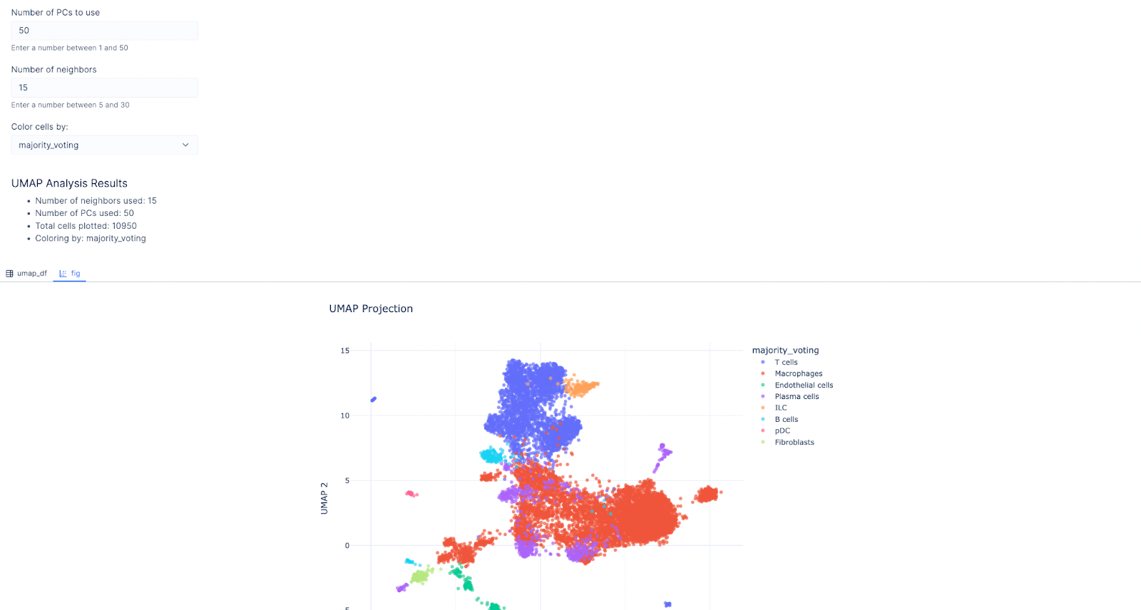
Pro-tip: You can ask the LLM to generate input widgets to facilitate more interactive analyses.
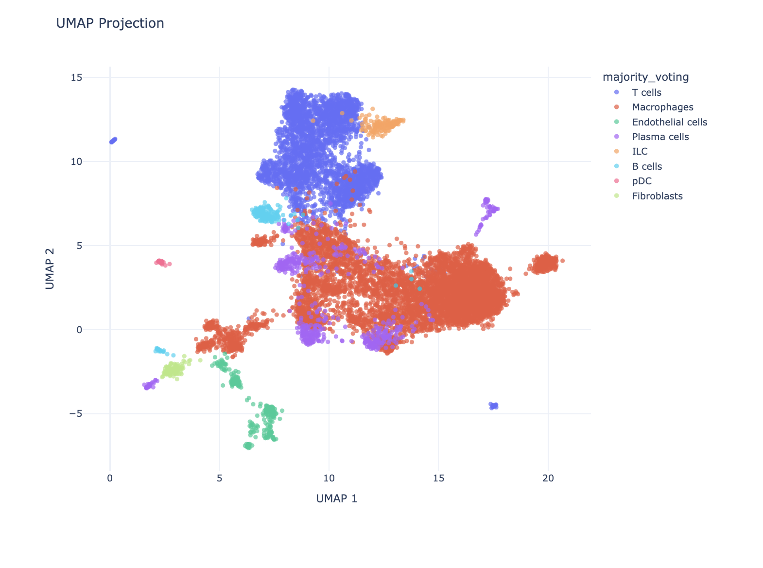
Pro-tip: You can also ask the LLM to install any library and use that library in its analysis.
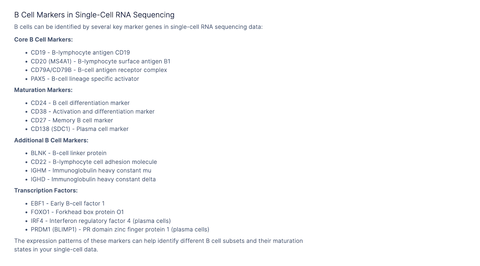
 We can also use the LLM to ask questions about gene markers of specific cell types.
Pro-tip: If you click on Focus and select Text, it will provide text responses to the question. If you choose Focus and select Analysis, it will write Python that queries an API to pull down hallmark marker genes from specific cell types. For the latter case, make sure you specify a well-maintained API or database that you trust to work well.
 We next asked it to make a widget, so users can select genes of interest and confirm the predicted cell type by looking at these marker genes.
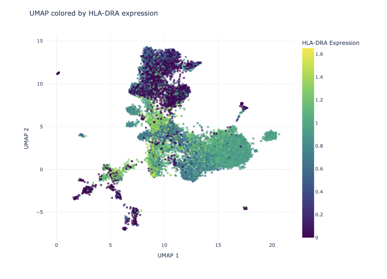
Prompt: Make a select widget that allows users to color the UMAP by expression of genes.
Result:
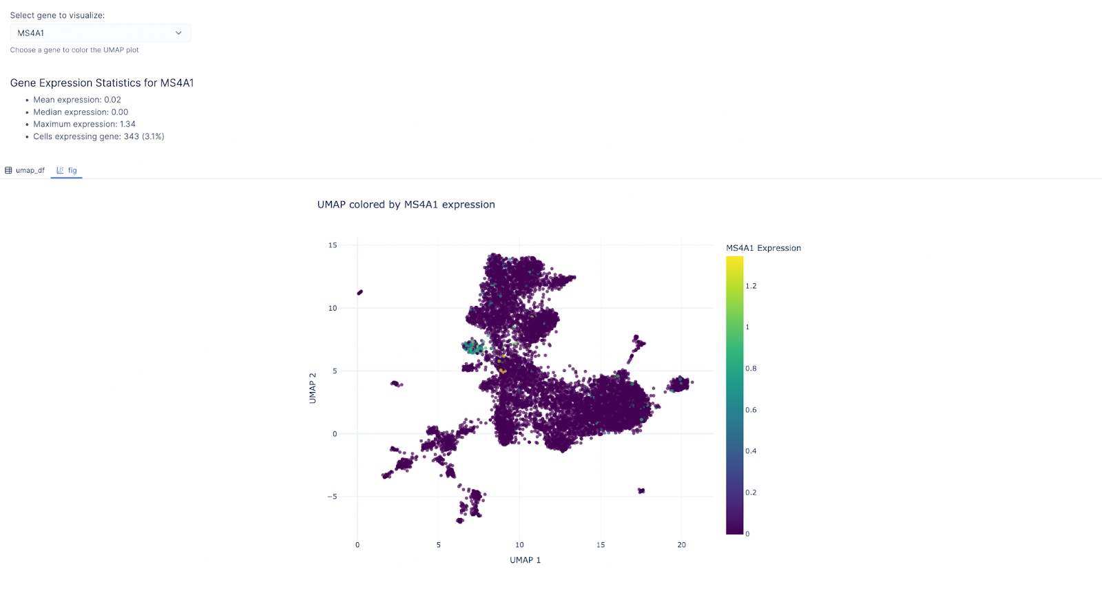 We then chose MS4A1 as the gene of interest as it’s a canonical for the B-lymphocyte surface antigen B1. Indeed, the cluster with B cell as the predicted cell type lit up!
Similarly, users can select HLA-DRA expression, a gene encoding the alpha chain of HLA-DR, a major histocompatibility complex (MHC) class II molecule. This gene is typically expressed by antigen-presenting cells like macrophages and dendritic cells to present antigens to CD4+ T cells. As anticipated, HLA-DRA shows higher expression in the cluster predicted to contain macrophages, supporting the accuracy of our cell type annotation.
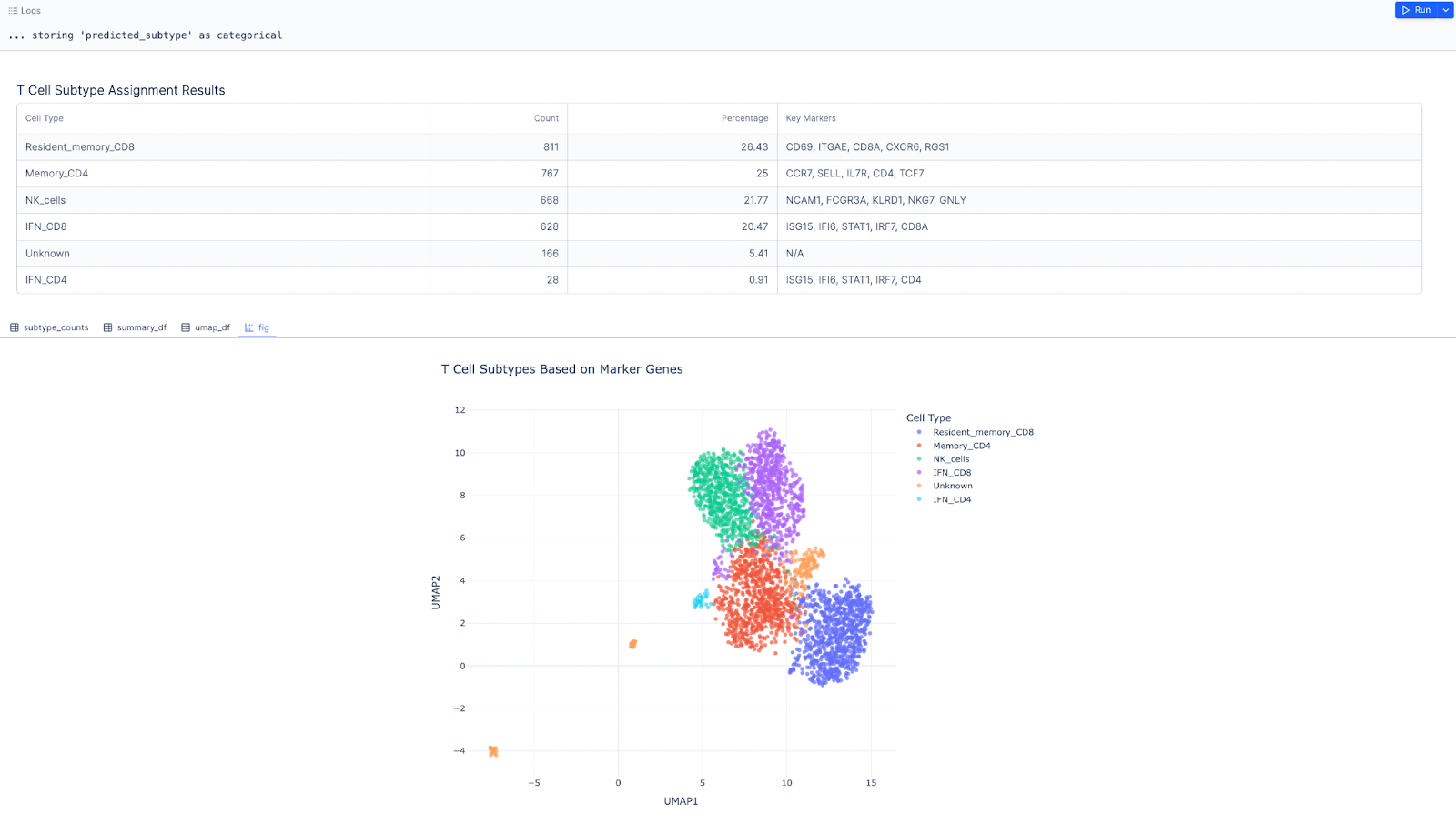
 Next, we want focus on the T cell cluster and further label more granular T cell types.
Prompt: Create a t_cell_adata object that’s a subset of the adata object, where majority voting is T cell
# Import required libraries
import scanpy as sc
import numpy as np
import pandas as pd
from lplots.widgets.text import w_text_output

# Create t cell mask based on majority voting
t_cell_mask = adata.obs['majority_voting'] == 'T cells'

# Create subset of adata with only T cells
t_cell_adata = adata[t_cell_mask].copy()

# Display summary statistics
t_cell_stats = pd.DataFrame({
    'Metric': [
        'Total T cells',
        'Percent of all cells',
        'Number of genes'
    ],
    'Value': [
        t_cell_adata.shape[0],
        f"{(t_cell_adata.shape[0] / adata.shape[0] * 100):.1f}%",
        t_cell_adata.shape[1]
    ]
})

w_text_output(
    content=f"### T Cell Subset Summary\n"
    f"{t_cell_stats.to_markdown(index=False)}"
)
-
Tregs cells
-
IFN-stimulated CD4 and CD8 T cells
-
Effector/exhausted CD8 T cells
-
Memory CD4 T cells
-
Resident memory CD8 T cells
-
NK cells
The script should:
-
Take an AnnData object as input (e.g., t_cell_adata).
-
Define marker genes for each cell type as a dictionary (you may provide generic examples).
-
Use these marker genes to assign cell types to clusters in the dataset.
-
Assume the clusters are precomputed and available in adata.obs[‘leiden’].
-
Use scanpy functions like tl.rank_genes_groups to refine marker assignments.
-
Output a table or file summarizing the assigned cell types and their marker genes.
Result:
 Next, we want to see gene express levels of various T cells markers.
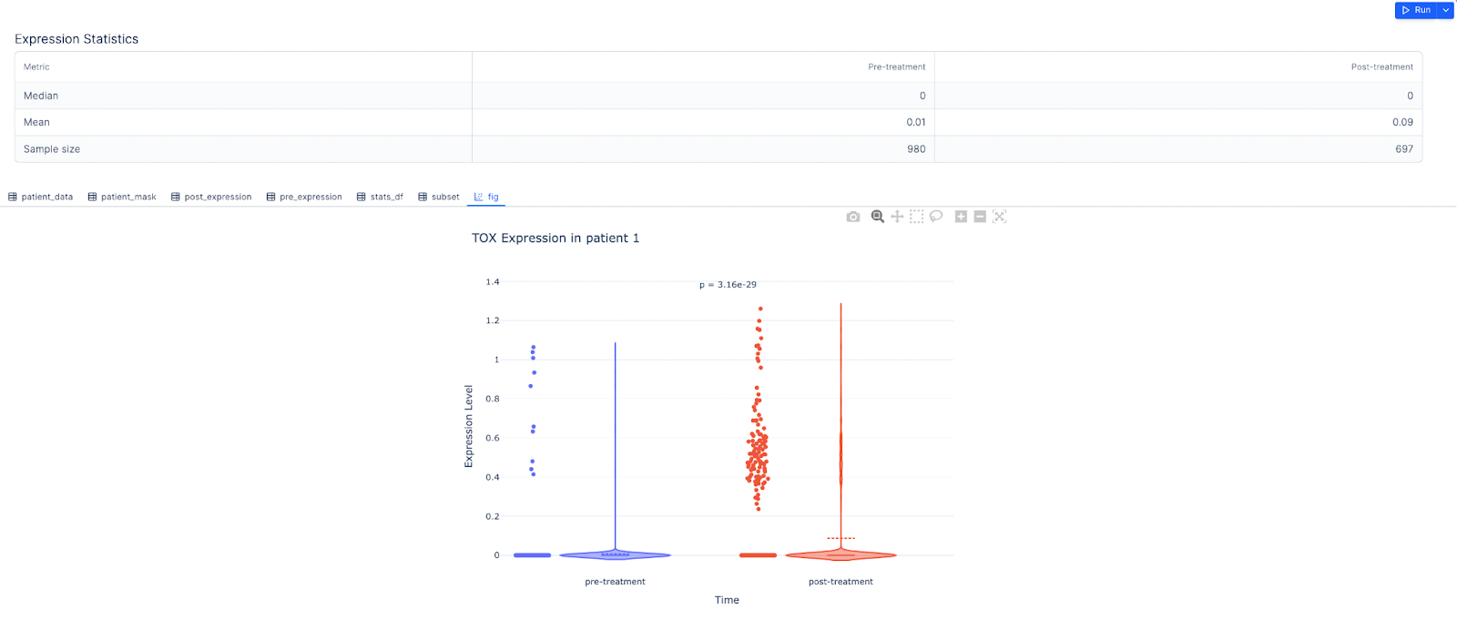
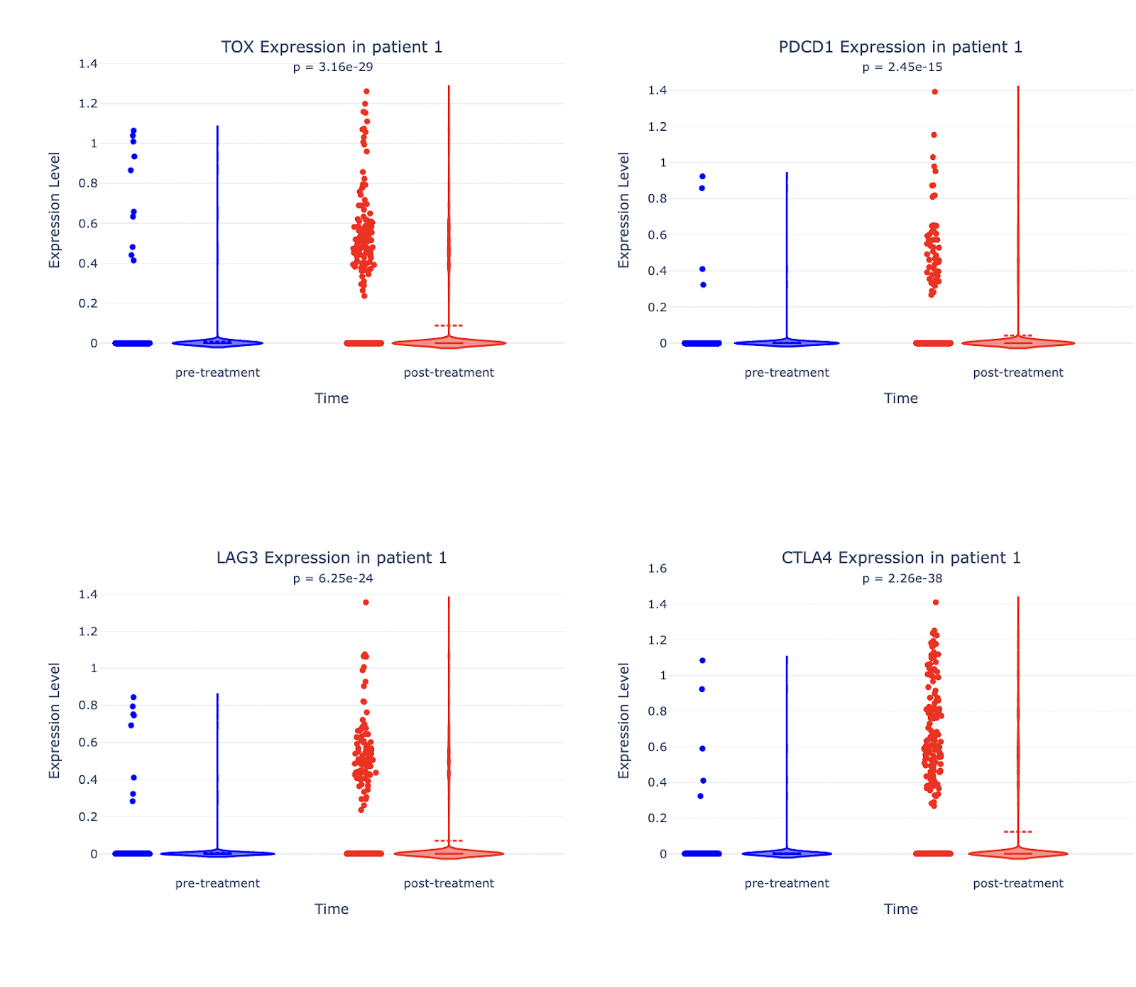
Markers like TOX, PDCD1 (PD-1), LAG3, and CTLA4 are hallmarks of T cell exhaustion, a dysfunctional state where T cells lose their ability to effectively kill tumor cells. High expression of these markers on CAR T cells post-treatment may indicate that the CAR T cells are becoming exhausted, reducing their efficacy in targeting glioblastoma cells.
Pembrolizumab blocks PD-1, a key exhaustion marker, to reinvigorate exhausted T cells. Monitoring PDCD1 (PD-1) and other exhaustion markers post-treatment helps assess whether pembrolizumab is successfully reversing T cell exhaustion.
Let’s proceed with creating violin plots to see expression of these markers pre- and post-treatment across different patients.
Prompt: For the gene TOX, create a violin plot of pre- and post-treatment for patient 1
Result:
 Prompt: Create the same plot for each of the following genes: TOX, PDCD1, LAG3, CTLA4.
Result:
 Prompt: Generate the same set of plots for all other patients in addition to Patient 1.
Result:
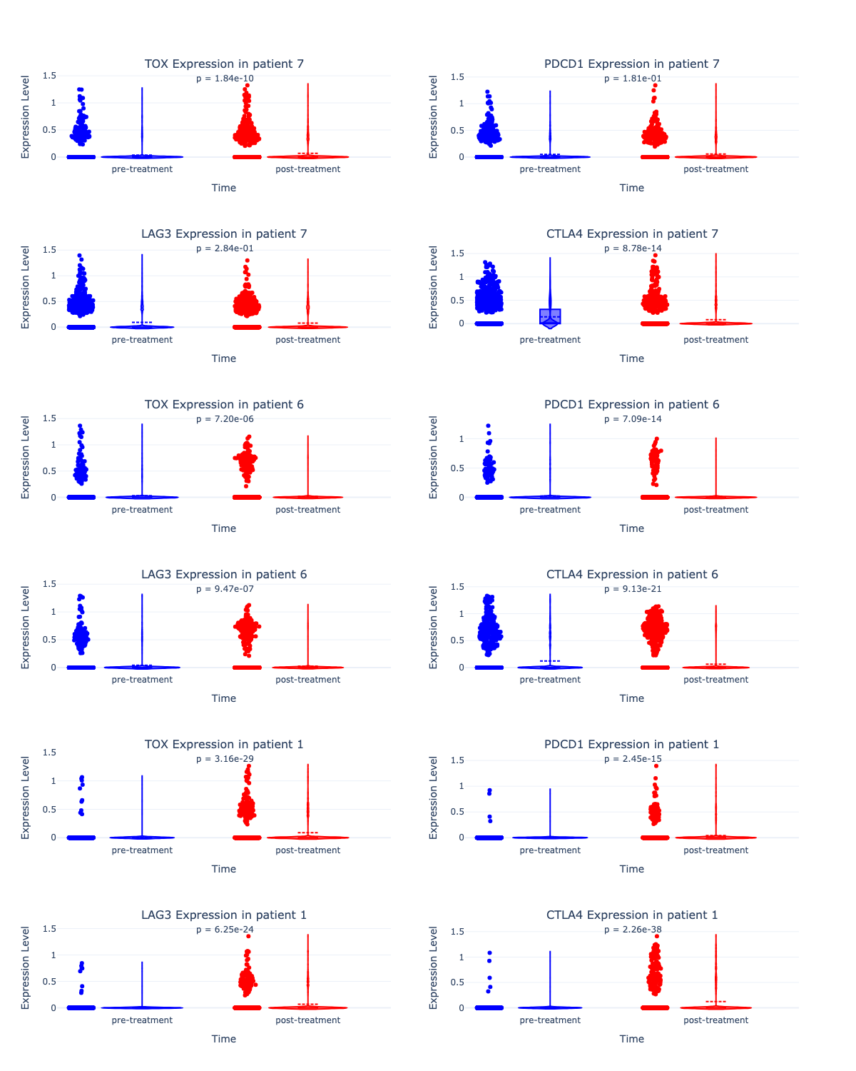 The LLM generated violin plots comparing pre- and post-treatment expression levels of four exhausted T cell markers for all 3 patients. The p-values (
<0.05) indicate a significant increase in the expression of these markers post-treatment. Further studies are likely needed to determine the extent to which these changes were driven by CAR T cells plus pembrolizumab.