.value on the variable, you can access the actual widget value. For example:
Supported Widget Types
Below is a comprehensive list of supported widget types.File Input
File Input
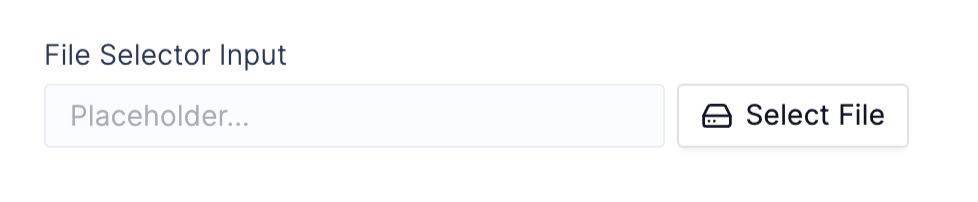
Widget Parameters
label: string string value (required)default: string latch data path string used as the default widget valuerequired: boolean a boolean that sets the input as requiring input by user and errored when emptyappearance: dict containing widget appearance attributes:"placeholder": string placeholder value displayed before a set value"detail": string secondary label text displayed after thet label"help_text": string informative text displayed below input"error_text": string error text displayed below input that replaceshelp_textand sets the input state as errored"description": string longer description text displayed in a hoverable tooltip next to the label
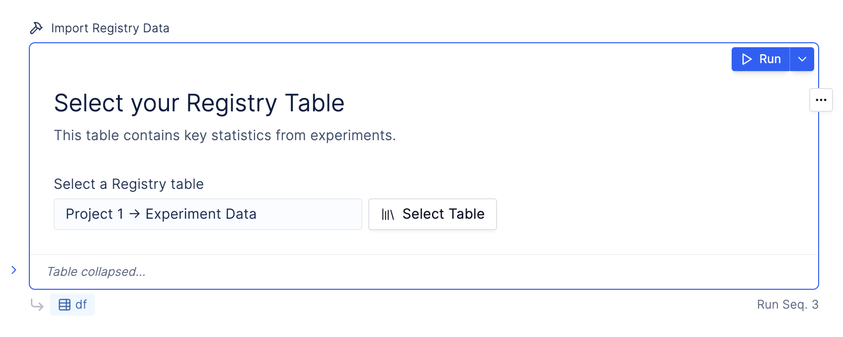
Registry Table Input
Registry Table Input
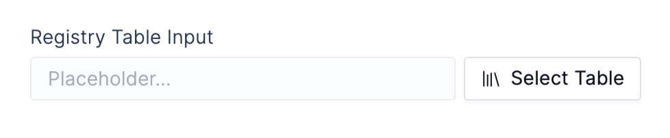
Widget Parameters
label: string label (required)default: string id of a registry tablerequired: boolean that sets the input as requiring input by user and errored when emptyappearance: dict containing widget appearance attributes:"placeholder": string placeholder value displayed before a set value"detail": string secondary label text displayed after thet label"help_text": string informative text displayed below input"error_text": string error text displayed below input that replaceshelp_textand sets the input state as errored"description": string longer description text displayed in a hoverable tooltip next to the label
Table Class Parameters & Methods
Parametersid: string id of registry tableMethodsTable.get_dataframe(): returns a pandas dataframe for the provided registry table idDatasource
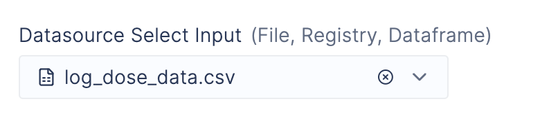
Datasource
Text Input
Text Input
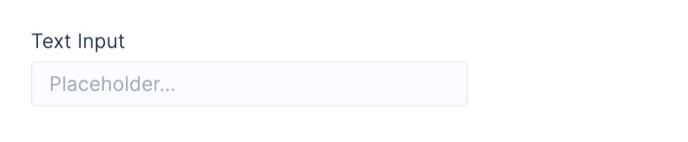
label: string label (required)default: default string value for inputrequired: a boolean that sets the input as requiring input by user and errored when emptyappearance: a dict containing widget appearance attributes:"placeholder": placeholder value displayed before a set value"detail": secondary label text displayed after thet label"help_text": informative text displayed below input"error_text": error text displayed below input that replaceshelp_textand sets the input state as errored"description": longer description text displayed in a hoverable tooltip next to the label
Select Input
Select Input
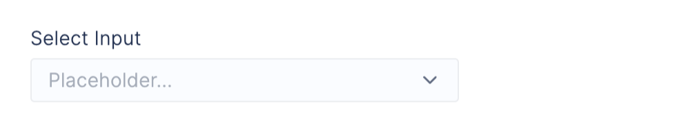
label: string label (required)options: list of values for the selectdefault: default option from optionsrequired: a boolean that sets the input as requiring input by user and errored when emptyappearance: a dict containing widget appearance attributes:"placeholder": placeholder value displayed before a set value"detail": secondary label text displayed after thet label"help_text": informative text displayed below input"error_text": error text displayed below input that replaceshelp_textand sets the input state as errored"description": longer description text displayed in a hoverable tooltip next to the label
Multiselect Input
Multiselect Input
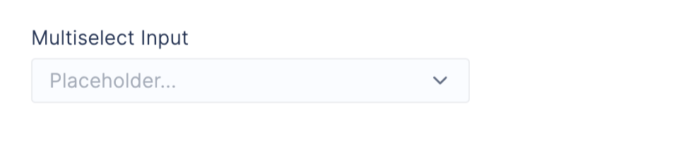
label: string label (required)options: list of values for the selectdefault: list of default options from optionsrequired: a boolean that sets the input as requiring input by user and errored when emptyappearance: a dict containing widget appearance attributes:"placeholder": placeholder value displayed before a set value"detail": secondary label text displayed after thet label"help_text": informative text displayed below input"error_text": error text displayed below input that replaceshelp_textand sets the input state as errored"description": longer description text displayed in a hoverable tooltip next to the label
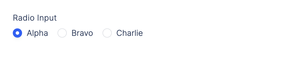
Radio Group Input
Radio Group Input
Checkbox Input
Checkbox Input

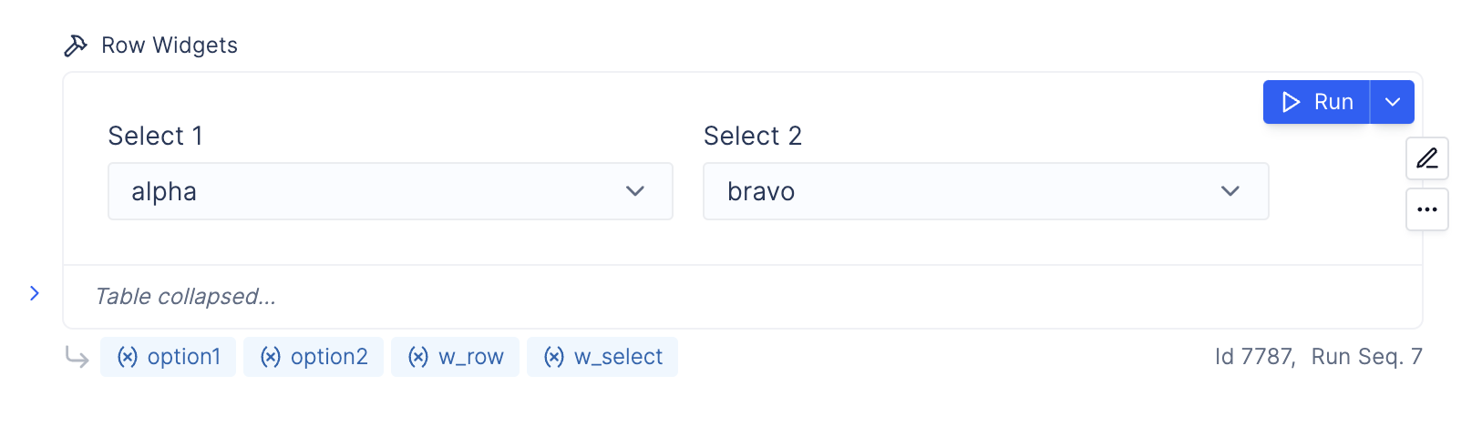
Mutliple Widgets in a Row
Mutliple Widgets in a Row
Button Widget
Button Widget
Widget Appearance
Each widget allows you to specify appearance and input discriptions.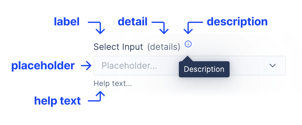
appearance: a dict containing widget appearance attributes:
"placeholder": placeholder value displayed before a set value"detail": secondary label text displayed after thet label"help_text": informative text displayed below input"error_text": error text displayed below input that replaceshelp_textand sets the input state as errored"description": longer description text displayed in a hoverable tooltip next to the label
Widgets Reactivity
- Every widget stores a Signal, which is the fundamental unit of reactivity in a Plot notebook.
- Signals hold dynamic values that change over time. When a signal’s value is updated, any notebook cell that references it is automatically re-executed.
- Each Signal consists of a writer and a listener:
- The writer sets the Signal’s value.
- The listener subscribes to the Signal and triggers automatic cell execution when the Signal changes.
- In this example, the text input widget
ais the writer. When the user inputs a new value, it updates the Signal associated witha. - Accessing
a.valuemakes the cell a listener. Whenever the input in a changes, the cell will automatically re-run. Callinga.valuealso returns the widget’s current value. - This reactivity extends to any downstream cell using
a.value, ensuring they also re-execute when a is updated.
Can I access a widget value without triggering a cell rerun?
To retrieve a widget’s value, you typically would use.value. However, there are times when you don’t want to trigger an automatic cell run when the widget value updates, especially if the cells using widget.value are computationally expensive. There are two solutions to this problem:
- Use a Button widget (Recommended)
- Use
.sample()
1. Use a Button Widget (Recommended)
A button widget allows you to manually trigger a cell run only when the button is clicked. Example: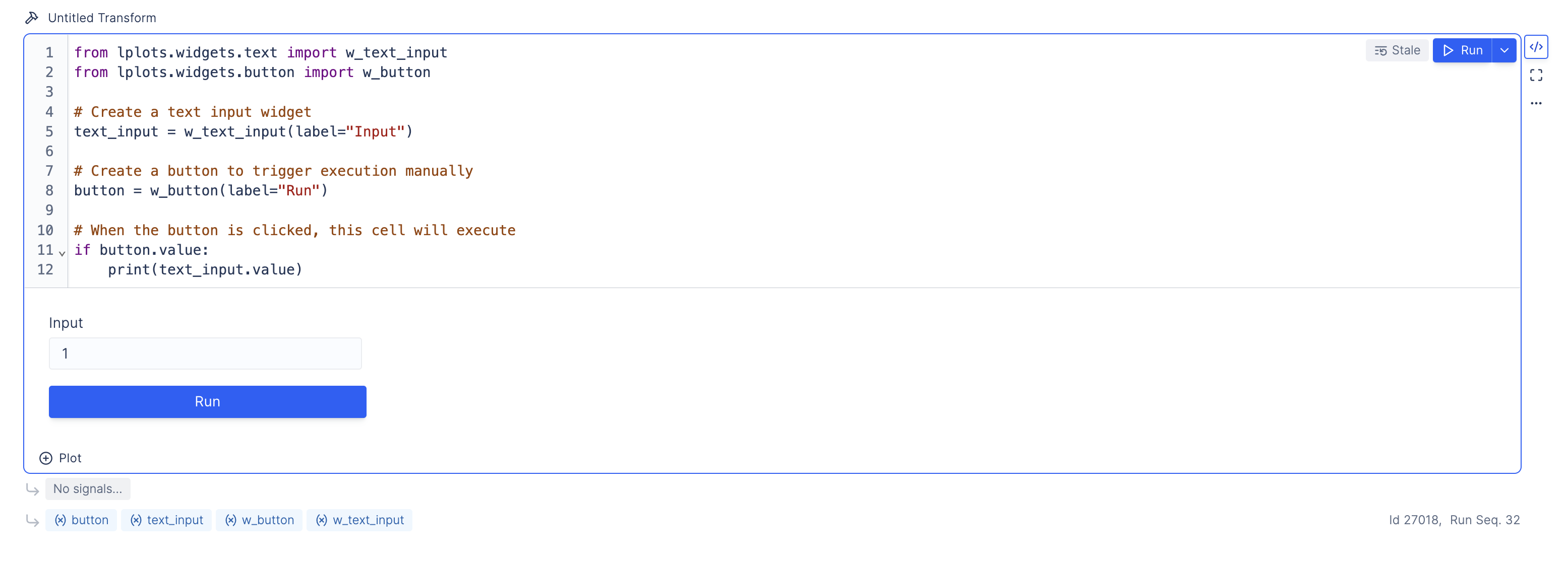
- The cell only executes when the user clicks the Run button.
- Widget value changes do not automatically rerun the cell, offering full control over execution.
2 - Use sample()
You can use .sample() to access the widget’s value without triggering a cell rerun. Think of .sample() as capturing a snapshot of the widget’s value at the precise moment you click the “Run” button in the upper right corner of a cell.
Examples:
The following code cell will automatically rerun whenever the widget value changes: