Time to complete tutorial: < 15 minutes
Key functionalities of the qPCR Template include:
- Calculate ΔCq and ΔΔCq
- Calculate fold change and percent relative expression
- Remove outliers using Grubbs’ Test or by removing points with standard deviations above a certain threshold
- Calculate aggregate statistics, such as mean and standard deviations (STDEV) or standard error of the mean (SEM).
Step 1: Set up a new qPCR Plot layout
First, navigate to the Plots tab on Latch. Next, click the Plot Layout button and select the qPCR Analyzer template. Give your plot layout a new name, ideally matching your experiment’s name. Creating a new plot layout for each experiment is highly recommended to prevent overwriting analyses and plots from previous experiments.Step 2: Specify Input Parameters
Below, we will guide you through inputting each parameter to ensure the analysis runs successfully. You can optionally select the Use Test Data checkbox to see an pre-loaded example that uses test data.qPCR Machine Output
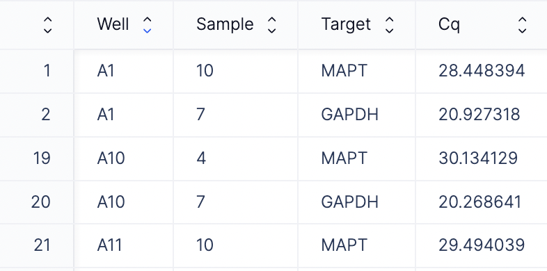
Here is where you can add your qPCR machine readout file. This file typically contains columns such as Well, Cq, Target. There are two options for files that can be provided here: a CSV or an Excel file.- CSV file: If you input a CSV file, please ensure that your file contains Cq, Well, Target as the column headers.
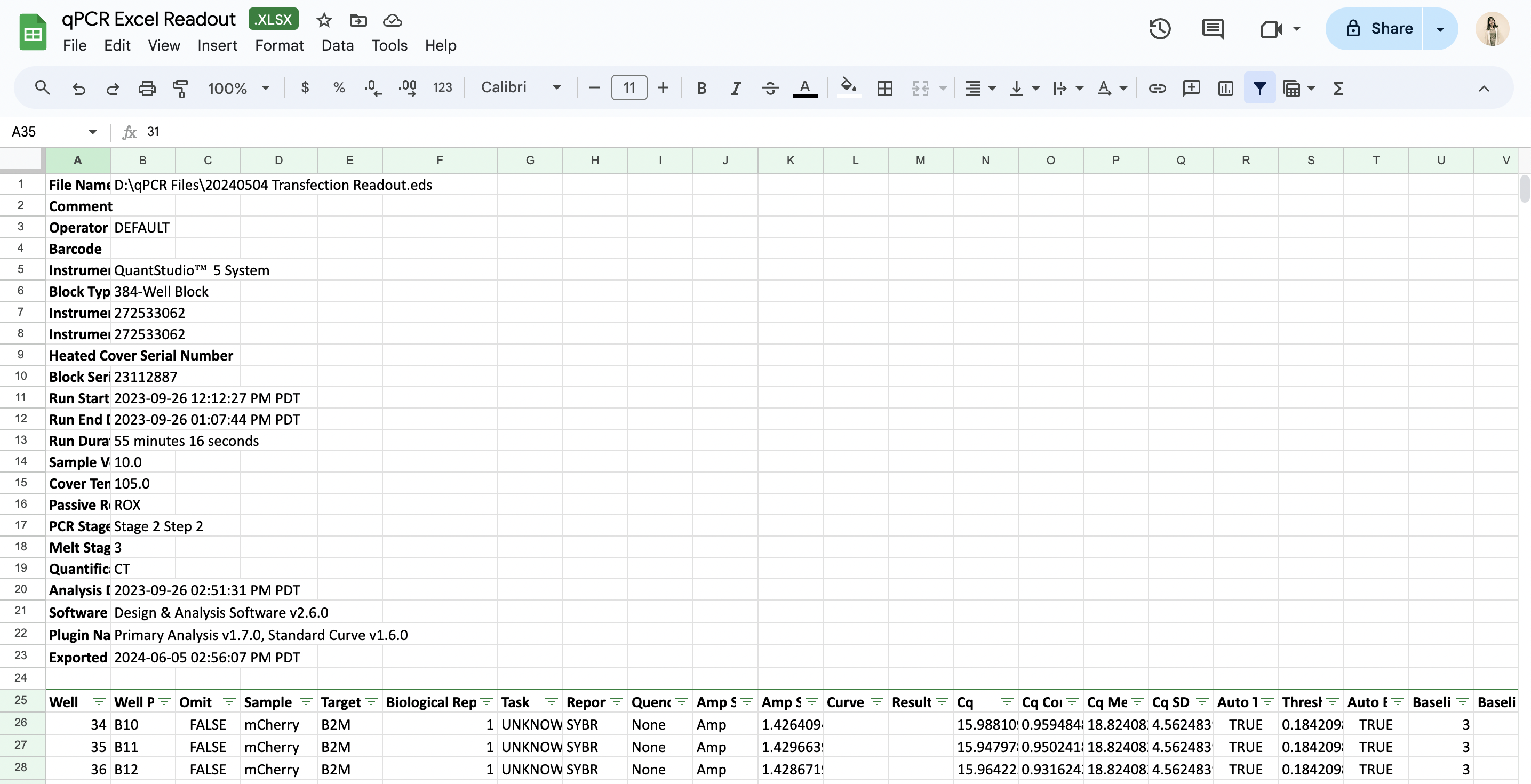
- Excel file: QuantStudio machines often output data in an .eds file format, which is typically converted to an Excel file by the end user. Latch Plots can also directly process these Excel files. The tool intelligently identifies the header row containing the Well, Cq, and Target columns, trims any metadata rows above this header, and saves the cleaned table for further analysis. An example Excel file that Plots can process is seen below. Similar to the CSV input option, please also ensure that your file contains three mandatory columns that contain targets, well IDs, and Cq values. By default, we skip the first 24 rows of metadata, which can be modified in the code.
Well column
Select the column header from your original CSV or Excel that contains well IDs (e.g. A1, A2).(Optional) Add a Plate Map CSV
In a typical qPCR experiment, a control sample is used as a reference point for ΔΔCq calculations. This control serves as a baseline to compare the expression levels of target genes in other samples, enabling the determination of relative gene expression changes. Common examples include untreated cells, vehicle-treated cells, and wild-type strains. Important: If your CSV/Excel file contains a column that specifies the condition for each replicate in every row, you can skip this step. If your CSV/Excel file does not contain a condition column, you have two options:- Revise the CSV to include this column.
- Use a template Excel plate map file that we provide to map out the experimental conditions. You can download the template CSV using this link.
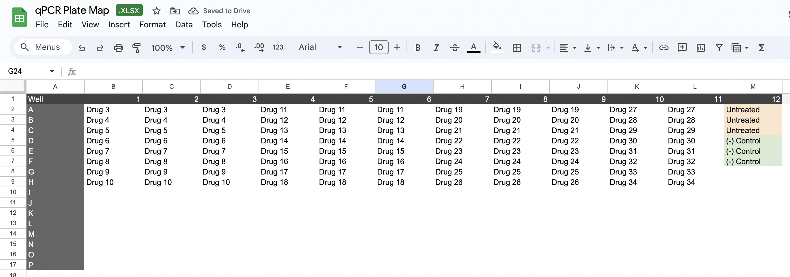
Latch Plots automatically merges plate map Excel sheets with qPCR machine readouts using well IDs, producing a clean dataset ready for analysis.
Cq column
Select the column header in your original CSV/ Excel that contains Cq or Ct values.Target column
Select the column header in your original CSV/Excel file that contains the target and housekeeping gene data. This is often labeled Target in QuantStudio readouts.Housekeeping gene(s)
Once you specify the Target column, the dropdown menu will update to display all gene values from that column. Then, select your housekeeping gene(s) from this list.Study Design
Your qPCR study design may include multiple condition variables. For instance, you might have multiple drugs (condition variable #1) and varying dosage levels per drug (condition variable #2). You may want to compare the relative expression of different dosages within a single group. Alternatively, you could have multiple tissue types with multiple drug treatments per tissue type. In this scenario, you’d want to compare the relative expression of various drug treatments against untreated samples within each tissue type. The two parameters below, group column and experimental condition column help specify the hierarchy of these conditions to ensure the correct experimental condition is used for ΔΔCq calculations downstream.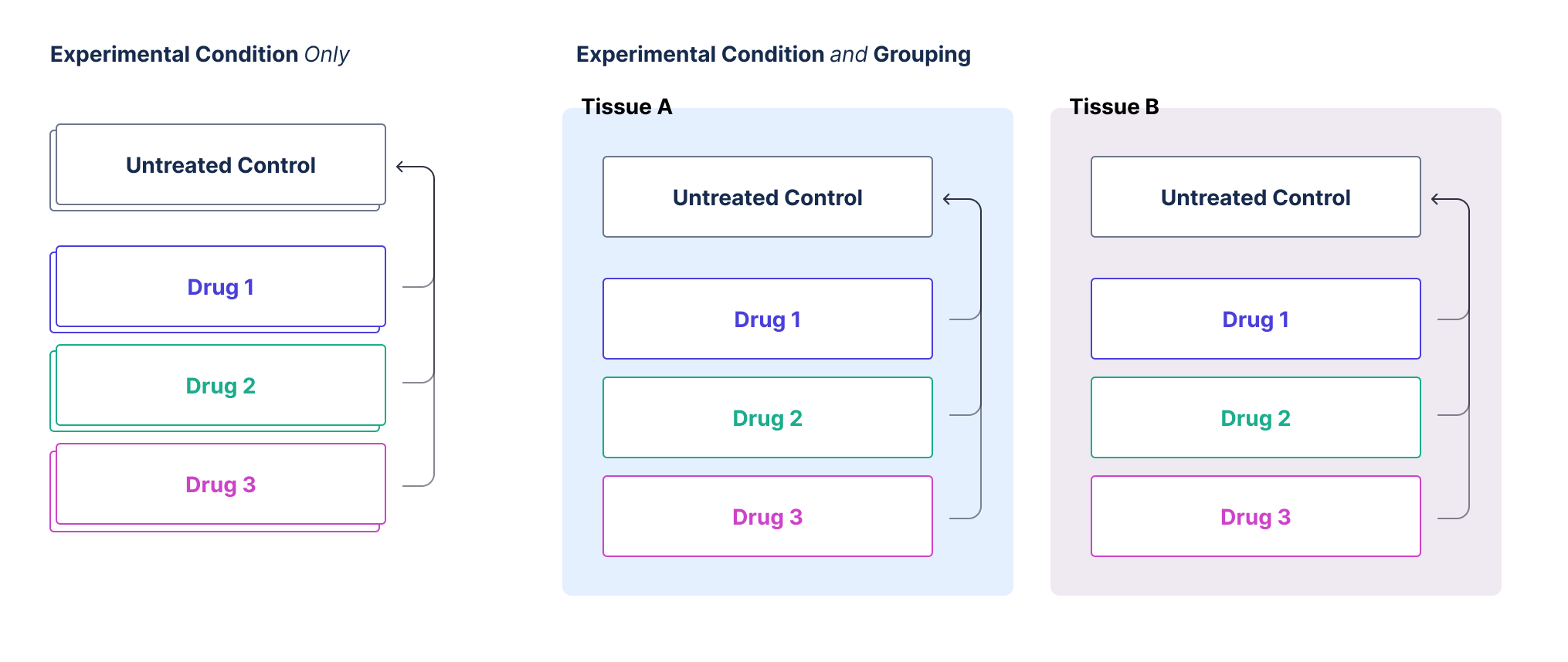
Group column
The group column represents the top-level condition by which your data is subsetted. This could represent a variety of factors, such as:- A specific drug treatment
- A type of tissue
- Any other treatment condition
Experimental condition column
The experimental condition column is used to specify the control value for your experiment for calculating ΔΔCq. This is likely a null dose or another treatment that you run across targets. For instance, if your experiment involves multiple tissues and different conditions for each tissue, you want to ensure that the control is applied within the correct tissue group.Key Points to Remember:
- Group Column: The main categorization of your data (e.g., drug, tissue).
- Experimental Condition Column: Specifies the control value within the grouped data.
Example
Consider an experiment with multiple tissues (e.g., liver, kidney) and various treatments (e.g., drug A, drug B) for each tissue. You want to compare the effects of these treatments within each tissue. By setting up the group column as the tissue type and the experimental condition column as the specific treatment, you ensure that the control values are accurately applied within each tissue group. If you only have one condition, the experimental condition column can be used to define your control directly, simplifying the setup. Give the group column the same value as you provide the experimental condition column.Control Condition
Once you’ve specified the experimental condition column, the dropdown menu here will display all available options for conditions across all wells and samples. Choose the condition that serves as the baseline control for ΔΔCq calculation.(Optional) Add additional columns to include
By default, the cleaned dataset only contains a minimal number of columns (Target, Cq, Well, Condition). If you have additional metadata you’d like to plot downstream and carry throughout the analysis, you can add them here.(Optional) Save your results
If you want to save the processed results as a CSV, you can simply input the experiment name and select an output directory in the Output Results section. Make sure to check the box once you are happy with your output directory path. Congratulations! You’ve completed all necessary inputs. Your Plot Layout will now run automatically, and all plots and results will appear below. In the next steps, we will walk through the description for each plot and how you can customize them.Step 3: Inspect Plots and Results Tables
3.1. Cq by Well
The Cq value indicates the cycle number at which a qPCR reaction’s fluorescent signal exceeds a predefined threshold, demonstrating the presence of detectable target DNA. Lower Cq values suggest higher concentrations of target nucleic acid, as fewer cycles are needed for detection. Conversely, higher Cq values indicate lower concentrations. The scatter plot below displays raw Cq values for target and housekeeping genes. The plot serves as a quick check to see if the Cq values for the target and housekeeping genes are as expected.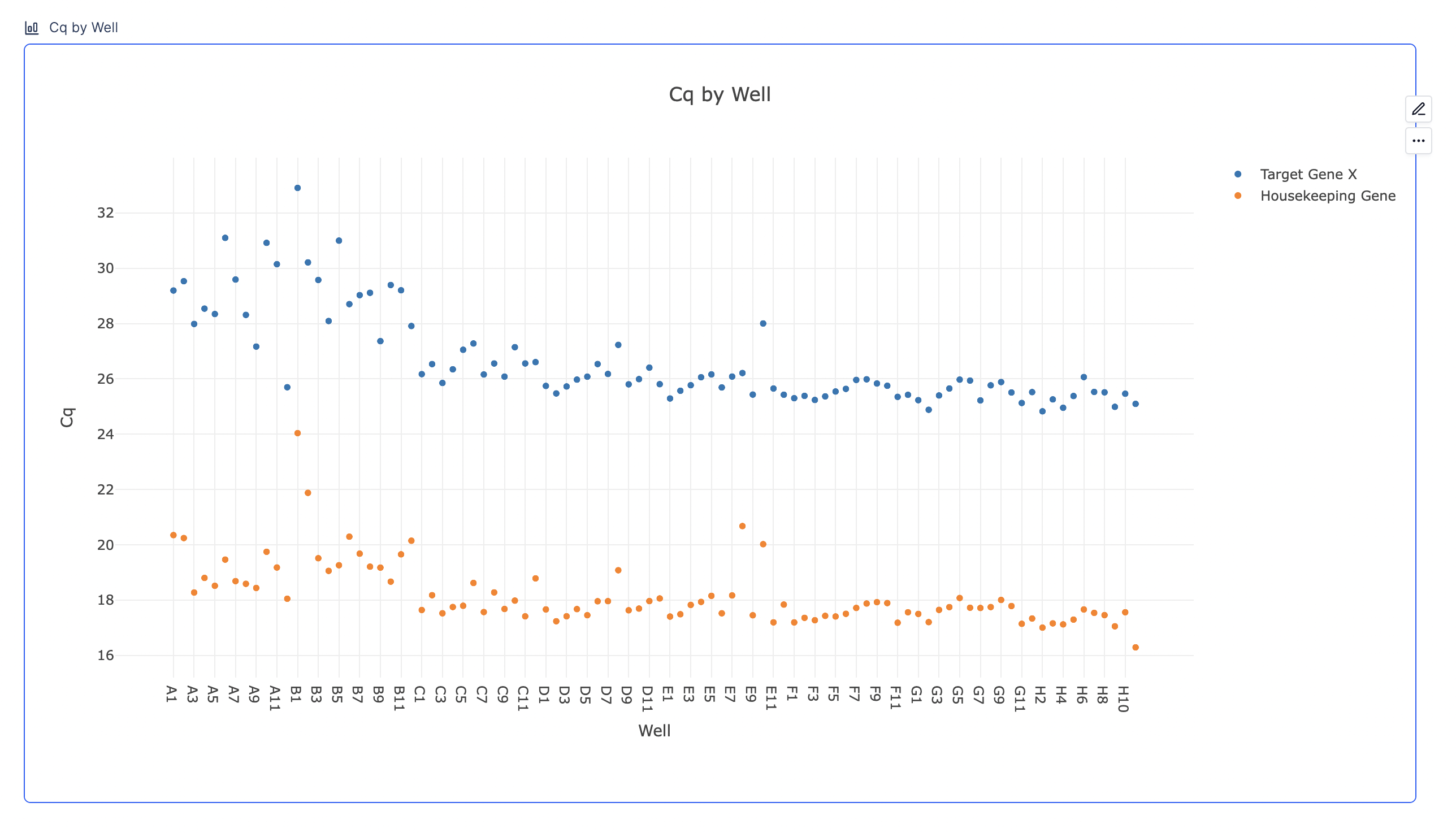
3.2. 𝚫Cq calculation
Method
This block displays the results of 𝚫Cq calculations. The𝚫Cq value for each target gene can be defined as:
The Cq value of the housekeeping gene is subtracted from the Cq value of the target genes.
- If your target and housekeeping gene for every replicate lies in the same well, we subtract the housekeeping gene’s Cq from the target gene’s Cq for that well.
- If your target and housekeeping gene for replicates of the same condition lies in different wells, we first take the average of the technical replicates for every biological sample. We then subtract the average Cq of the housekeeping gene’s biological sample from the average Cq of the target gene’s biological sample.
Results
- 𝚫Cq result tables for each target gene: You will see a new table has been created for every target or non-housekeeping gene. (e.g. 𝚫Cq_TargetGeneX, 𝚫Cq_TargetGeneY, etc.)
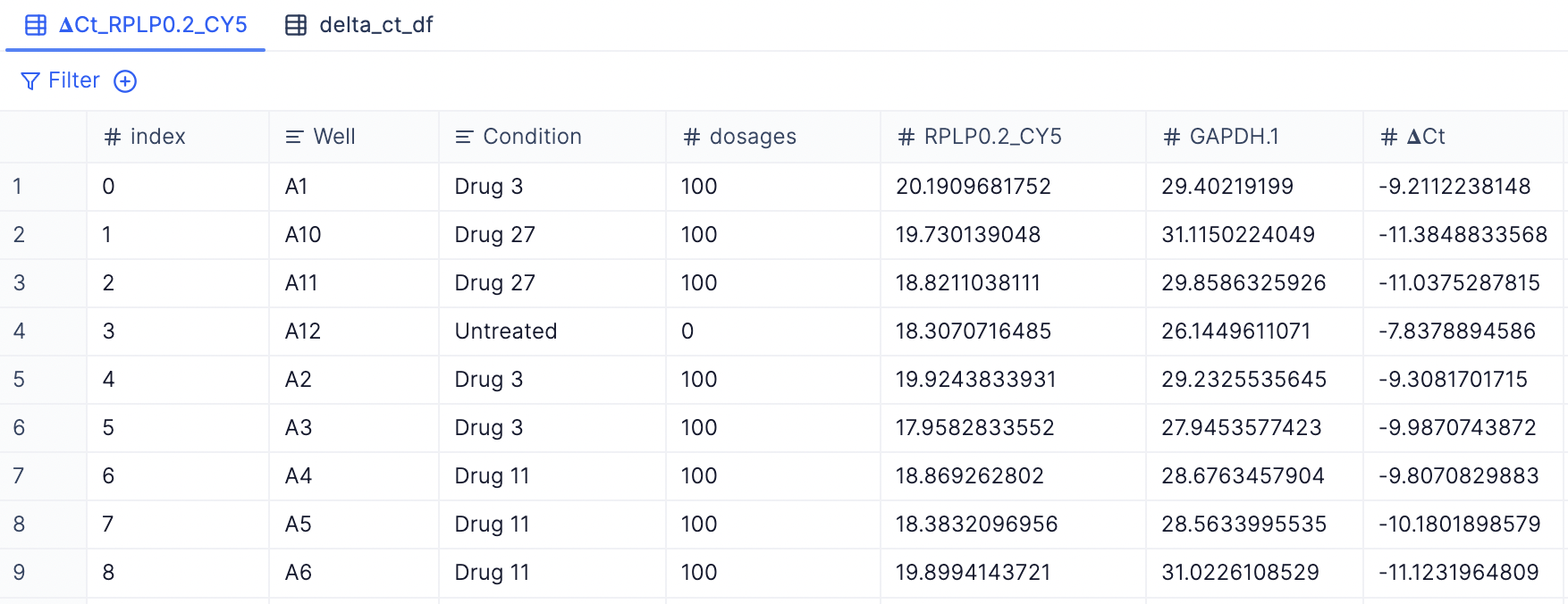
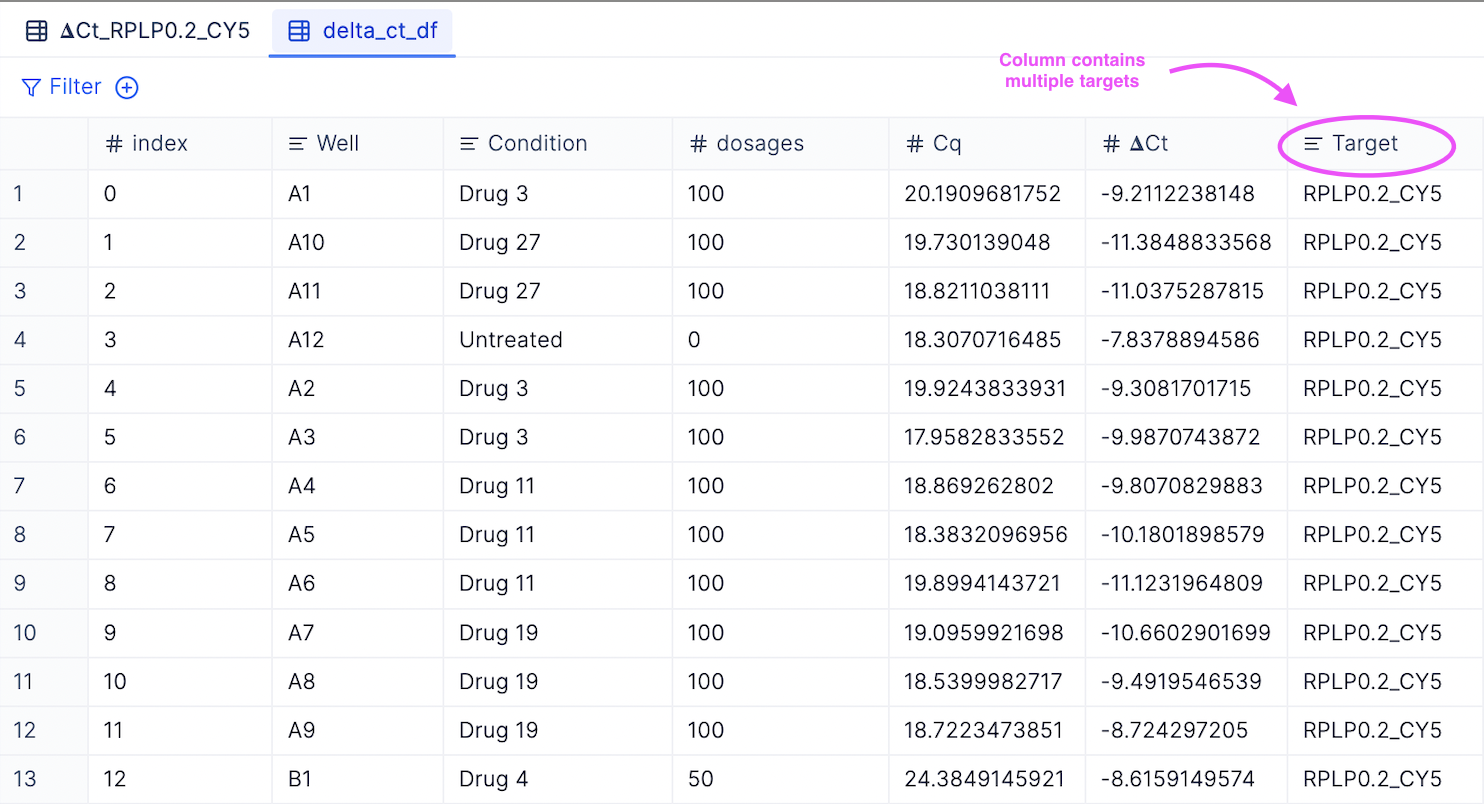
- Merged 𝚫Cq table with all target genes: You can view a merged table with all non-housekeeping gene targets by checking out the delta_ct_df tab.
3.3. 𝚫𝚫Cq calculation
Method
Consider a qPCR experiment with multiple tissues (such as liver and kidney) and various treatments (such as Drug A and Drug B) for each tissue, where you aim to compare the effects of these treatments within each tissue. In this scenario, the workflow initially segregates the samples into distinct groups—for example, a Liver group and a Kidney group. To calculate the ΔΔCq, you first determine the average ΔCq for the control samples in each group. Then, you subtract this average ΔCq from the ΔCq of all other samples to assess the relative expression levels. (If your experiment is less complex, lacking multiple high-level groups as described above, the workflow treats your setup as a single large group.)Result Tables
- 𝚫𝚫Cq result tables for each target gene: You will see a new table has been created for every target or non-housekeeping gene. (e.g. 𝚫𝚫Cq_TargetGeneX, 𝚫𝚫Cq_TargetGeneY, etc.)
Description of the table columns
Description of the table columns
The columns in this table include:
- Well (from Step 1)
- Condition (from Step 1)
- Target (from Step 1)
- Cq (from Step 1)
- All other metadata columns (specified in the Add additional columns to include field from Step 1)
- 𝚫Cq: The ΔCq value is the difference between the threshold cycle (Ct) values of the target gene and the reference (housekeeping) gene in the same sample.
- Relative expression: the amount of target gene expression normalized to a reference gene
- Mean Control 𝚫Cq: the average ΔCq value of the control samples. It serves as the baseline for comparing other experimental samples.
- 𝚫𝚫Cq: the difference between the ΔCq of the experimental sample and the Mean Control ΔCq.
- Fold Change: indicates the relative change in gene expression in the experimental sample compared to the control sample. It is calculated using the ΔΔCq value.
- Percent Expression: represents the expression level of the target gene in the experimental sample as a percentage of its expression in the control sample.
- Percent Repression: indicates the decrease in gene expression in the experimental sample compared to the control sample.
- Merged 𝚫𝚫Cq table with all target genes: You can view a merged table with all non-housekeeping gene targets by checking out the delta_ct_df tab.
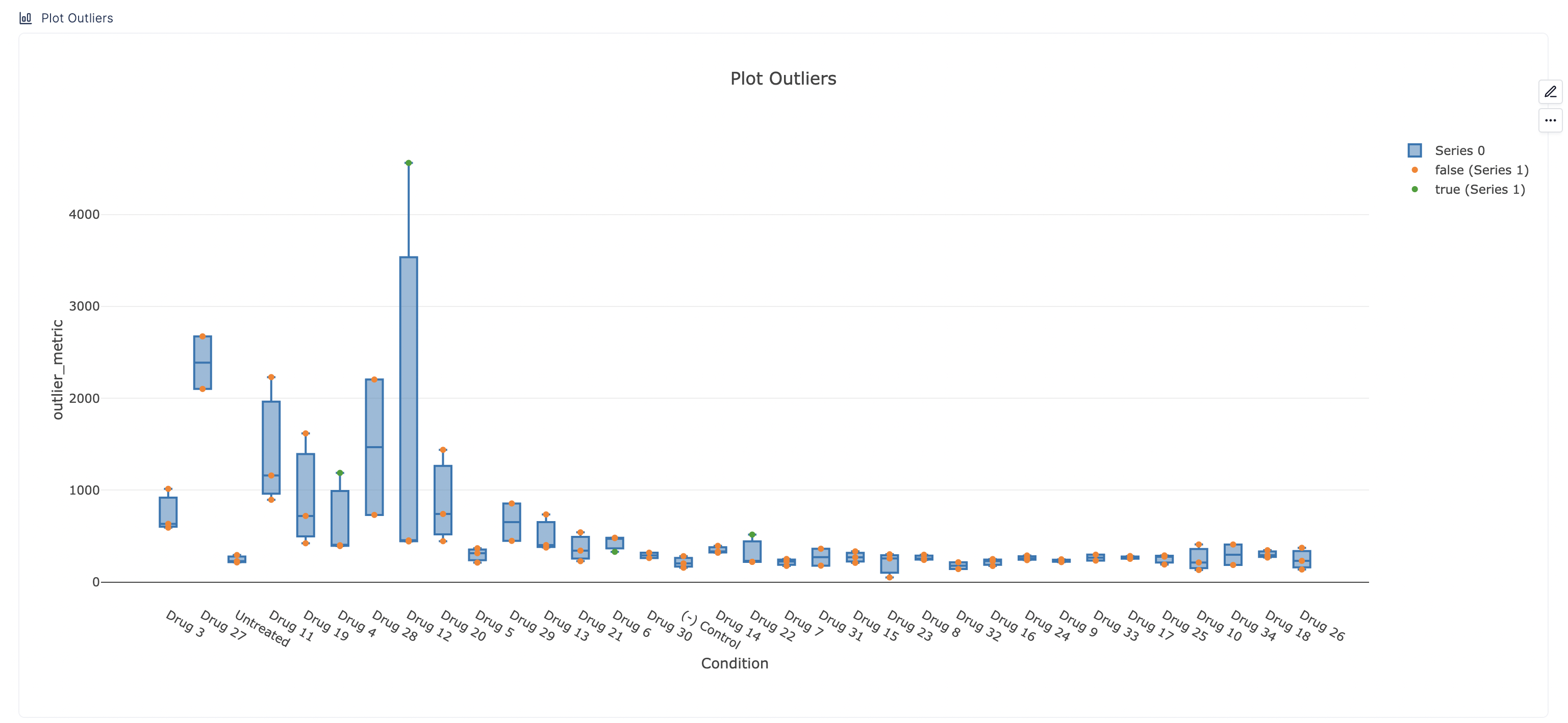
3.4. (Optional) Outlier Removal
Here, you can optionally perform outlier removals using Grubbs’ or with a standard deviation cutoff.Input Parameters
- Input data: Specify the dataset you would like to remove outliers for. The dropdown of options likely includes all the tables generated from the previous steps. As a refresher, these tables are 𝚫𝚫Cq for each target gene, 𝚫Cq for each target gene, delta_ct_df table which contains 𝚫Cq for all target genes, and delta_ct_ct_df table which contains 𝚫𝚫Cq for all target genes.
- Measurement (e.g. Relative Expression, 𝚫𝚫Cq): Specify the column from which outliers will be removed. This is the column that represents the metric of interest, such as Relative Expression or 𝚫𝚫Cq.
- Group by (Optional): If you do not enter anything here, outliers will be removed across the entire column selected above. However, if you prefer to remove outliers within specific subsets of your data, enter the grouping criterion here. For example, if you group the data by condition, outliers will be identified and removed within replicates associated with each condition.
- Select outlier removal method: There are two statistical methods provided for removing outliers: Grubbs and standard deviations cutoff.
Result Tables
- delta_delta_ct_df_outliers: Contains outliers that were removed.
- delta_delta_ct_df_outliers: The clean dataset where outliers have been removed.
- plot_outliers: The table that has been organized in a way that facilitates easy plotting of outliers downstream.
Plots
In the plot below, the outliers will be plotted in green, while retained data points will be shown in orange. If no outliers are identified, all points will be orange. This plot is plotting the plot_outliers table generated above. This table has a column called is_outlier, which has a True/False value for each row, denoting if that row was identified as an outlier.