> ## Documentation Index
> Fetch the complete documentation index at: https://wiki.latch.bio/llms.txt
> Use this file to discover all available pages before exploring further.
# Analyzing PMCB 3k Cells with Pollock: Latch Single-cell Visualizer 🎨
> In this tutorial, we will walk through how to analyze the Peripheral Blood Mononuclear Cells (PBMC) freely available from 10X Genomics using Pollock: Latch Single Cell Visualizer. The tutorial is inspired by Seurat and Scanpy’s original PBMC tutorial with an aim to provide a simple walk-through of how similar functionalities can be achieved through Latch’s single-cell visualizer.
To add the raw PBMC dataset to your Latch account, please use the link here.
Through this tutorial, you will be able to:
1. Perform quality control and filtering to select cells for downstream analysis
2. Perform normalization
1. \[Bonus] Add your own custom code for analyses not available out of the box
3. Visualize gene expression on embeddings (PCA, UMAP, tSNE)
4. Identify marker genes between clusters within the neighborhood embeddings
5. Dynamically generate differential expression across cell types and tissues.
## Mental Model
The Latch Browser allows scientists to iteratively transform their count matrix through a series of well defined steps that are easy to reason about and recover. Each of these steps ingest some desired count matrix and produce a new, modified value without modifying the original one. One can freely transform their matrices as composable chains of these "data mutations" without fear of losing intermediate steps. (Our “data mutations” are loosely inspired by the class of atomic operations used by database systems to perform safe transformations of data)
For instance, looking at the left sidebar of the visualizer, we see that a new count matrix is created after the QC/ Filtering and Normalization step. In other words, the data mutations **QC/Filtering** and **Normalization** each results in a distinct, new child matrix.
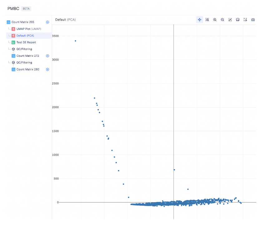 Due to the iterative nature of single-cell analysis, it is often helpful to go back to a previous count matrix to re-perform QC based on the observation in a downstream analysis.
With the model above, it is easy to return to a previous count matrix and perform additional analyses. Furthermore, if multiple team members are collaborating on a count matrix, each can generate their own child matrices and work on them individually.
Now that we understand the principles of our single-cell visualizer, let’s start analyzing the PBMC dataset!
## Standard preprocessing workflow
*Currently, the single cell visualizer uses scanpy for all analysis steps. If there is a package that you would like us to support an additional package, send us a note at [hannah@latch.bio](mailto:hannah@latch.bio)!*
### Quality Control
Before analyzing single-cell gene expression data, we must ensure that all cellular barcode data correspond to viable cells.
One way to check the quality of the dataset is by viewing the PCA plot, as shown on the left hand side.
Due to the iterative nature of single-cell analysis, it is often helpful to go back to a previous count matrix to re-perform QC based on the observation in a downstream analysis.
With the model above, it is easy to return to a previous count matrix and perform additional analyses. Furthermore, if multiple team members are collaborating on a count matrix, each can generate their own child matrices and work on them individually.
Now that we understand the principles of our single-cell visualizer, let’s start analyzing the PBMC dataset!
## Standard preprocessing workflow
*Currently, the single cell visualizer uses scanpy for all analysis steps. If there is a package that you would like us to support an additional package, send us a note at [hannah@latch.bio](mailto:hannah@latch.bio)!*
### Quality Control
Before analyzing single-cell gene expression data, we must ensure that all cellular barcode data correspond to viable cells.
One way to check the quality of the dataset is by viewing the PCA plot, as shown on the left hand side.
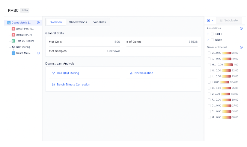 Here, we see that the majority of our cells are skewed towards the first principal component , suggesting a small subset of our data might contain unknown bias potentially adversarial to our analysis, so we may want to perform QC to eliminate outlier cells. (Note that this sort of QC is highly context-dependent and one often should analyze results with and without such outlier removal - a task made by the atomic data mutations that allow easy rollback to previous count matrix states.)
To perform cell QC, click on the first Count Matrix and select **Cell QC/ filtering** under **Preprocessing**.
Here, we see that the majority of our cells are skewed towards the first principal component , suggesting a small subset of our data might contain unknown bias potentially adversarial to our analysis, so we may want to perform QC to eliminate outlier cells. (Note that this sort of QC is highly context-dependent and one often should analyze results with and without such outlier removal - a task made by the atomic data mutations that allow easy rollback to previous count matrix states.)
To perform cell QC, click on the first Count Matrix and select **Cell QC/ filtering** under **Preprocessing**.
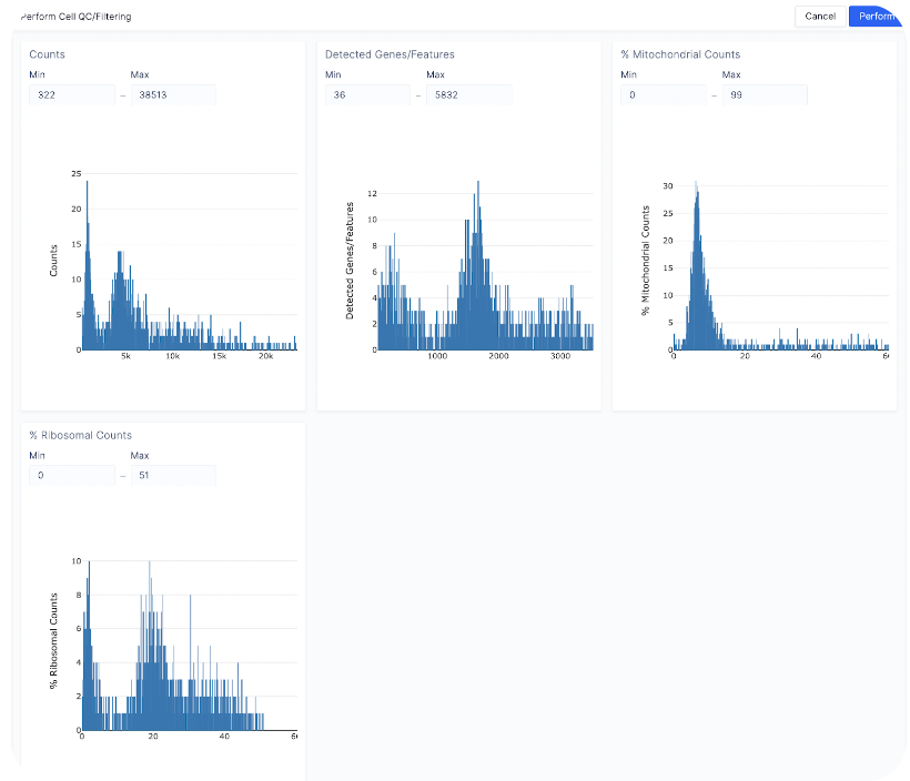 You can perform cell QC on four different covariates to filter out low-quality cells: the number of counts per barcode (count depth), the number of genes per barcode, the fraction of counts from mitochondrial genes per barcode, and the fraction from ribosomal genes per barcode.
To filter out outlier cells, we can set the four metrics as following:
* Count depth: Min (322) - Max (15000)
* Detected genes/Features: Keep the same
* % Mitochondrial Counts: Min (0) - Max (20)
* % Ribosomal Counts: Keep the same
You can perform cell QC on four different covariates to filter out low-quality cells: the number of counts per barcode (count depth), the number of genes per barcode, the fraction of counts from mitochondrial genes per barcode, and the fraction from ribosomal genes per barcode.
To filter out outlier cells, we can set the four metrics as following:
* Count depth: Min (322) - Max (15000)
* Detected genes/Features: Keep the same
* % Mitochondrial Counts: Min (0) - Max (20)
* % Ribosomal Counts: Keep the same
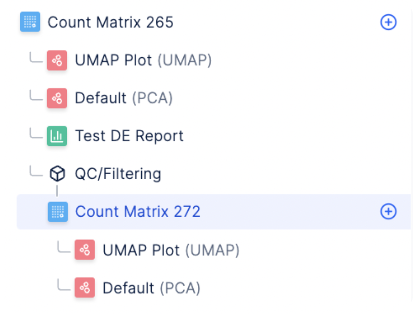 Click **Perform** to execute the QC and filtering step. You should see a new count matrix generated under the title QC/ Filtering on the left sidebar.
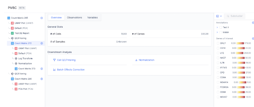 Navigate to the newly created count matrix.
 You can see that the number of cells is now 1049, whereas in the original matrix, the number of cells was 1500. This means that our QC/ Filtering step was performed successfully.
### Normalization
We use counts per million (CPM) normalization for scaling count data to obtain correct relative gene expression abundances between cells.
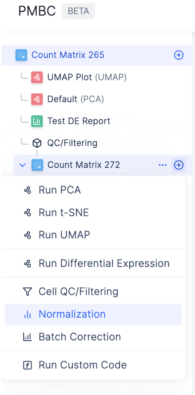
To start normalizing the dataset, select the plus sign next to the count matrix post-QC and choose **Normalization**.
You can see that the number of cells is now 1049, whereas in the original matrix, the number of cells was 1500. This means that our QC/ Filtering step was performed successfully.
### Normalization
We use counts per million (CPM) normalization for scaling count data to obtain correct relative gene expression abundances between cells.
To start normalizing the dataset, select the plus sign next to the count matrix post-QC and choose **Normalization**.
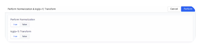 Normalize the data matrix to 1,000,000 reads per cell by setting **Perform Normalization to True**. Logarithmize the data by setting **log(p+1) Transform** to **True**.
 You should see a new matrix generated under **Log Transform** and **Normalization**.
### Bring-Your-Own-Code for Custom Analyses
As every single cell dataset is unique, it may be desirable to run custom code to preprocess your data in addition to the existing functionalities on Latch.
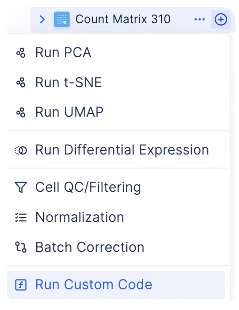
You can do so by clicking on the plus sign next to a count matrix and select plus icon **Custom Code**.
You should see a new matrix generated under **Log Transform** and **Normalization**.
### Bring-Your-Own-Code for Custom Analyses
As every single cell dataset is unique, it may be desirable to run custom code to preprocess your data in addition to the existing functionalities on Latch.
You can do so by clicking on the plus sign next to a count matrix and select plus icon **Custom Code**.
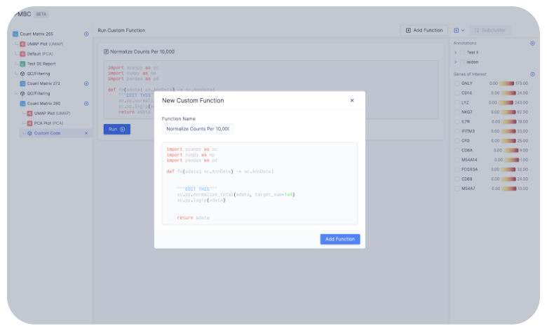 For example, here we are creating a function to normalize counts per 10,000 instead of the default count per million.
Note that in the current version, the custom code functionality is limited to numpy, scanpy, and pandas packages only.
For example, here we are creating a function to normalize counts per 10,000 instead of the default count per million.
Note that in the current version, the custom code functionality is limited to numpy, scanpy, and pandas packages only.
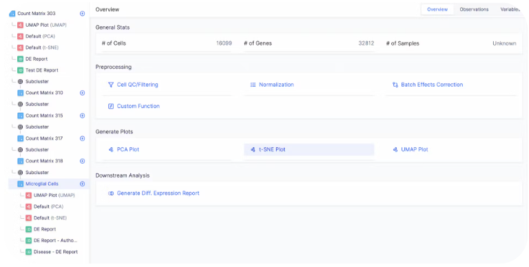 Select **Run** to run the custom code. Once the custom code is run, a new matrix is created under **Custom Code** on the left sidebar.
## Downstream Analysis
### Generating the embedding graph
To create tSNE, UMAP, or PCA embeddings on the dataset, you can navigate to the desired count matrix and select the embedding of your choice.
Select **Run** to run the custom code. Once the custom code is run, a new matrix is created under **Custom Code** on the left sidebar.
## Downstream Analysis
### Generating the embedding graph
To create tSNE, UMAP, or PCA embeddings on the dataset, you can navigate to the desired count matrix and select the embedding of your choice.
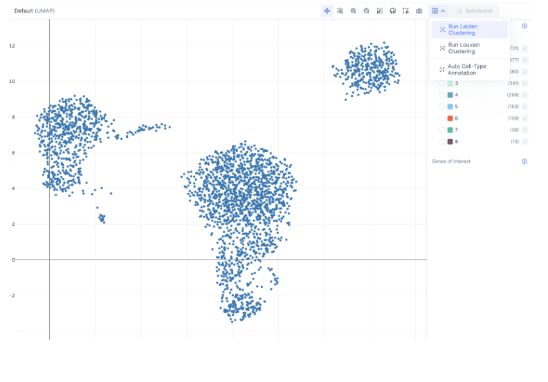 Here, we visualize our single cell clusters in UMAP embedding.
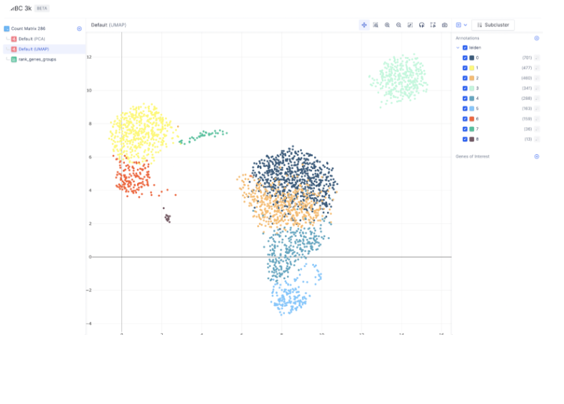 To further create clusters within the neighborhood graph embedding, we can select the Leiden clustering method.
 All Leiden clusters can be shown on the UMAP using the annotation on the right hand side.
### Finding Marker Genes
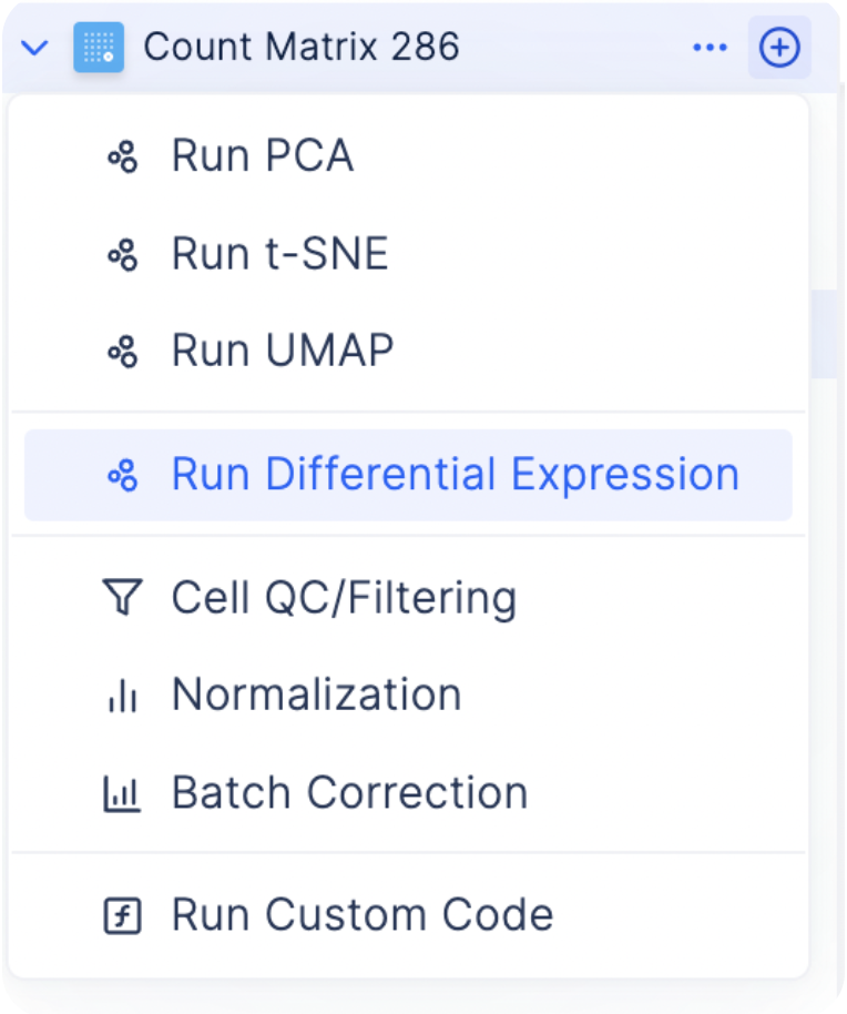
To find the most differentially expressed genes in each group, select the plus icon next to each count matrix and choose **Run Differential Expression**.
All Leiden clusters can be shown on the UMAP using the annotation on the right hand side.
### Finding Marker Genes
To find the most differentially expressed genes in each group, select the plus icon next to each count matrix and choose **Run Differential Expression**.
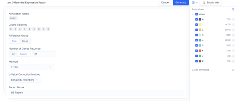 You will be given the option to select the different expression method. As recommended by the scanpy’s tutorial, here we select **T-test** which is the fastest and simplest way to get a ranked gene list for each Leiden cluster in comparison with the rest.
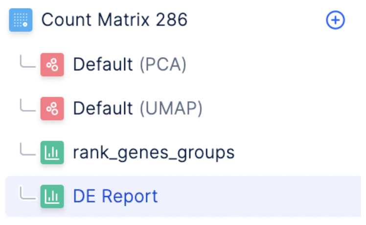 Select the **DE Report** under the count matrix to view the marker gene report.
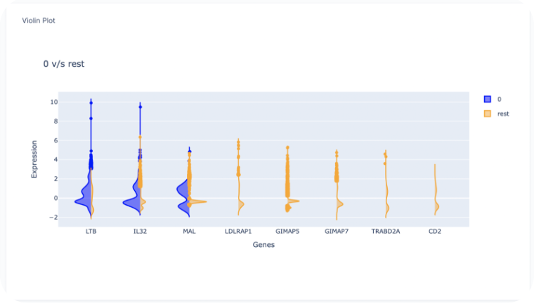
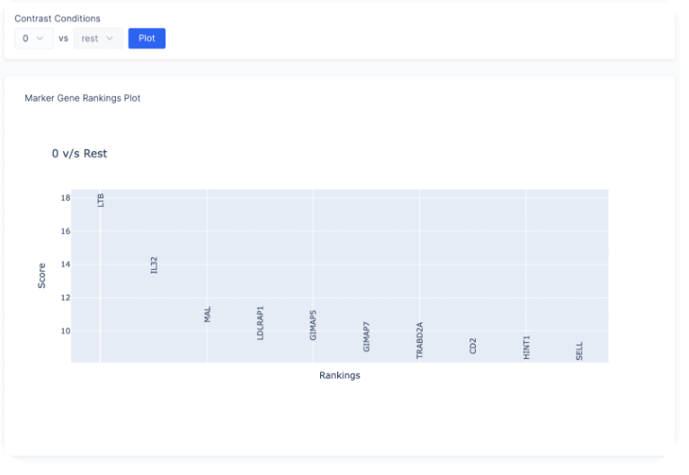 Here, we observe that **LTB, IL32, and MAL** are the highest ranked genes for cluster 0 in the one vs all comparison.
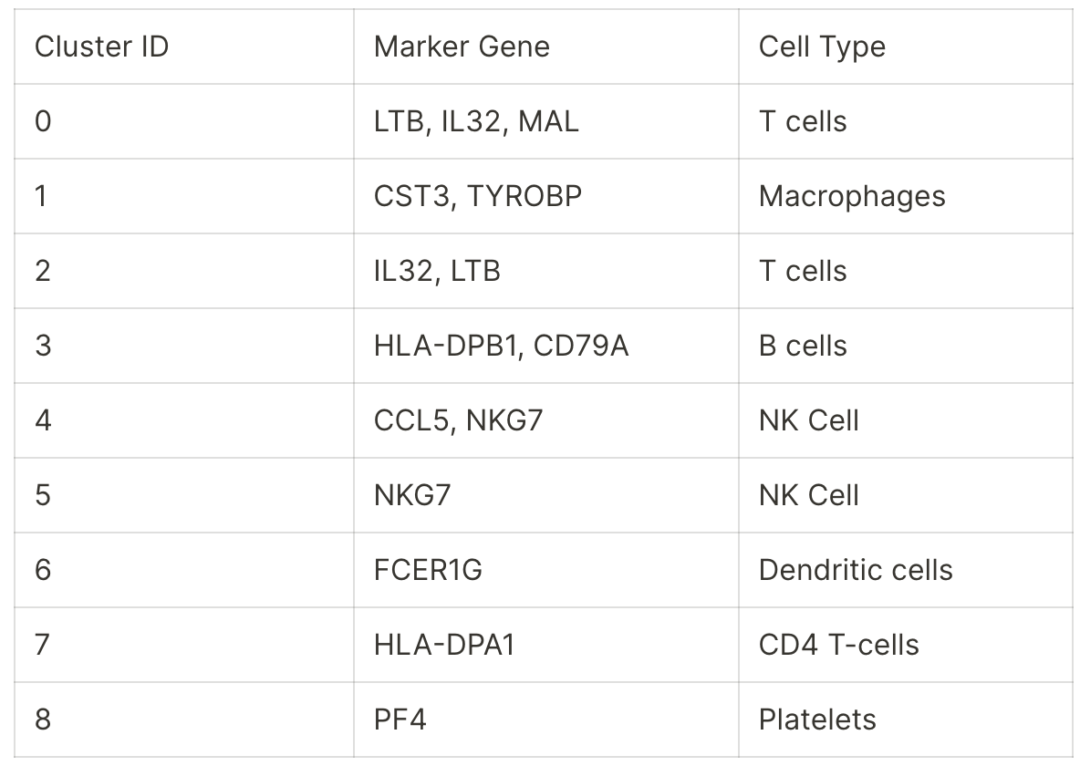
Similarly, we can perform the one vs all comparisons for the rest of the Leiden clusters to identify their corresponding marker genes. We summarize all the marker genes found per cluster below:
Here, we observe that **LTB, IL32, and MAL** are the highest ranked genes for cluster 0 in the one vs all comparison.
Similarly, we can perform the one vs all comparisons for the rest of the Leiden clusters to identify their corresponding marker genes. We summarize all the marker genes found per cluster below:
 To determine the cell type corresponding to each marker gene set, we use PanglaoDB. The query results are populated in the table below:
 ### Heatmap of Gene Expression
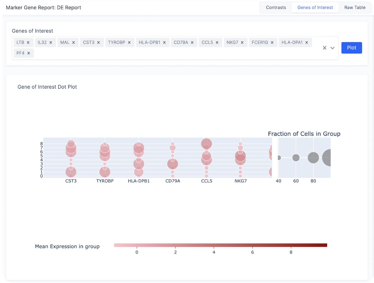
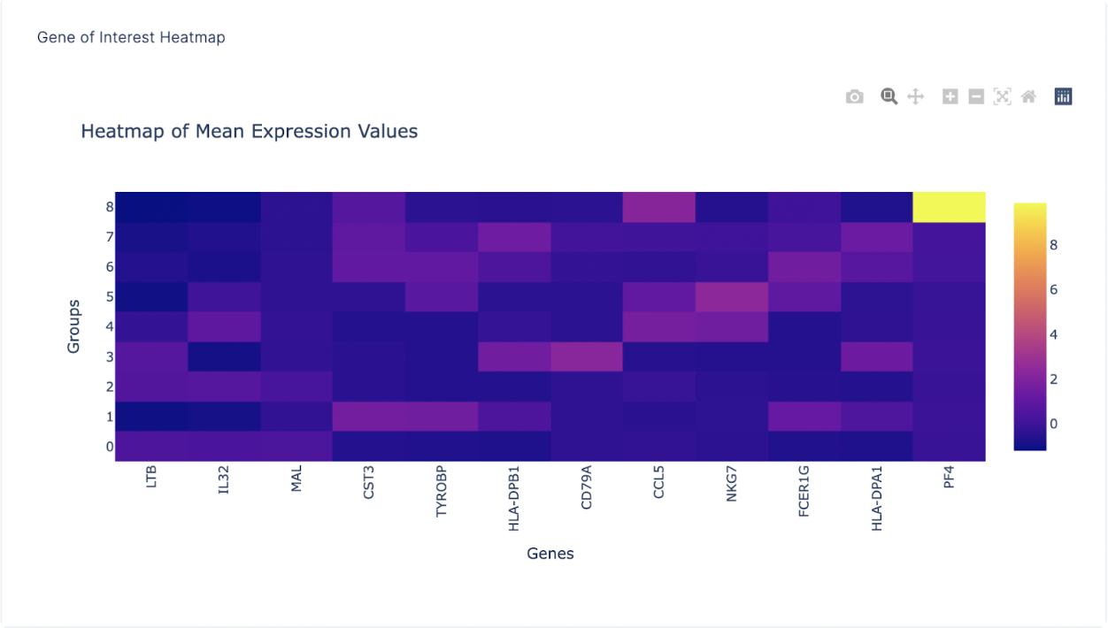
After finding a list of ranked marker genes, we can also compute a dot plot and heatmap of mean expression values in the **Gene of Interest Tab** by inputting the list of genes of interest.
### Heatmap of Gene Expression
After finding a list of ranked marker genes, we can also compute a dot plot and heatmap of mean expression values in the **Gene of Interest Tab** by inputting the list of genes of interest.
 ### Subsetting Cell Clusters
For a large number of cells, it is often helpful to subset a cluster of specific cell type and re-perform Louvain to identify cell subtypes.
To subset a group of cells, first toggle the annotations on the right sidebar to display all the cells you want to subset and select **Subcluster**.
### Subsetting Cell Clusters
For a large number of cells, it is often helpful to subset a cluster of specific cell type and re-perform Louvain to identify cell subtypes.
To subset a group of cells, first toggle the annotations on the right sidebar to display all the cells you want to subset and select **Subcluster**.
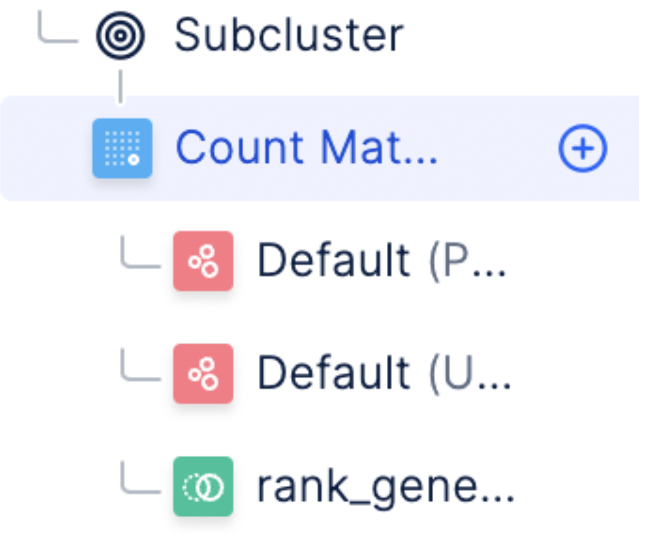
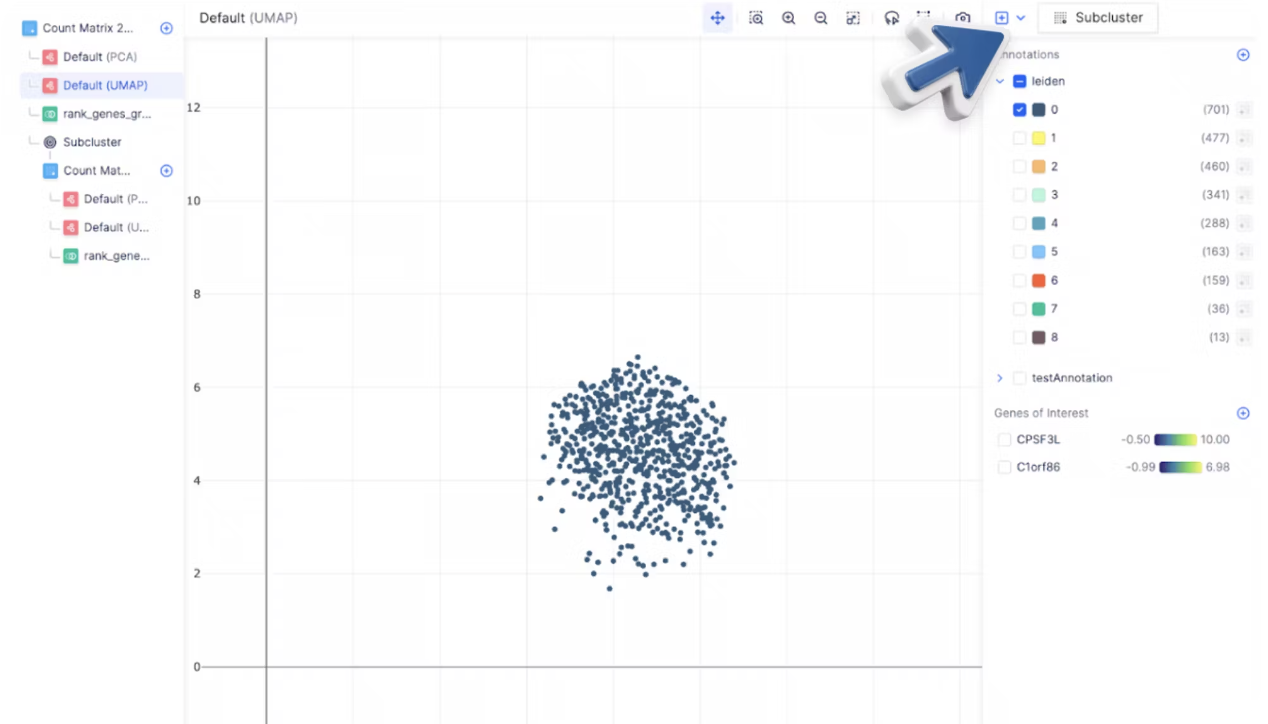 A new count matrix is generated under the **Subcluster** branch.
 On the cell subset, you can now perform Louvain clustering by clicking on **Louvain** clustering to find new subclusters.
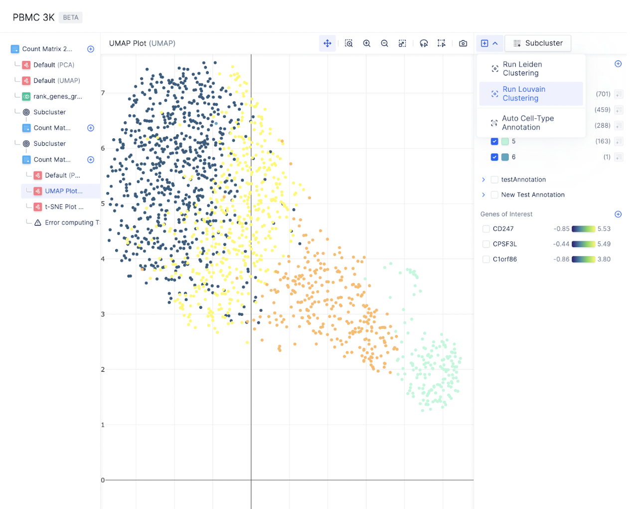 Because every count matrix mutation is tracked, you can reiteratively zoom in, subset cells, perform subclustering, annotate new subclusters, perform differential expression, and repeat without ever losing track of a previous count matrix!
### Key Takeaways
* With Pollock, you have learned how to:
* Perform quality control and filtering to select cells for downstream analysis
* Perform normalization
* \[Bonus] Add your own custom code for analyses not available out of the box
* Visualize gene expression on embeddings (PCA, UMAP, tSNE)
* Identify marker genes between clusters within the neighborhood embeddings
* Dynamically generate differential expression across cell types and tissues.
* Pollock’s model allows scientists to reiteratively analyze their single-cell data through a series of well-defined steps, where each step and the corresponding count matrix is always saved.
### What’s Next
* Try out the single-cell visualizer [here](https://console.latch.bio/apps).
* Read our next tutorial to see how to replicate Nature’s paper: “Single cell RNA sequencing of human microglia uncovers a subset associated with Alzheimer’s disease” (Olah et. al, 2020)
Because every count matrix mutation is tracked, you can reiteratively zoom in, subset cells, perform subclustering, annotate new subclusters, perform differential expression, and repeat without ever losing track of a previous count matrix!
### Key Takeaways
* With Pollock, you have learned how to:
* Perform quality control and filtering to select cells for downstream analysis
* Perform normalization
* \[Bonus] Add your own custom code for analyses not available out of the box
* Visualize gene expression on embeddings (PCA, UMAP, tSNE)
* Identify marker genes between clusters within the neighborhood embeddings
* Dynamically generate differential expression across cell types and tissues.
* Pollock’s model allows scientists to reiteratively analyze their single-cell data through a series of well-defined steps, where each step and the corresponding count matrix is always saved.
### What’s Next
* Try out the single-cell visualizer [here](https://console.latch.bio/apps).
* Read our next tutorial to see how to replicate Nature’s paper: “Single cell RNA sequencing of human microglia uncovers a subset associated with Alzheimer’s disease” (Olah et. al, 2020)